On Twitter, things happen quickly. A single Tweet has a four times shorter shelf life than, for example, Facebook content. As a result, it would be disastrous to use the same direct-response techniques from AdWords.
So, before you start crafting your ad, learn about the keys to success on Twitter. We evaluated 13 Twitter advertising examples and rated them accordingly. Continue reading to comprehend essential Twitter best practices and discover practical advice that you can use right away.
Key Points
- This article ranks promoted Tweets according to their type, creative content, headline, and ad text. Each of these Tweets is outlined according to its strengths and weaknesses and provides insights into what makes a successful Twitter ad.
- We found the top three promoted Tweets to be NUOPTIMA, N26, and EU HaDEA. Common elements of success include effective targeting, a clear and visually appealing ad creative, and concise ad copy that includes questions, creates urgency, and presents a strong call to action.
- The three lowest-ranking Twitter ads examples in this article are from S&P, Aspose, and Cohere AI. Poor formatting, unattractive or irrelevant ad creatives, and unclear calls to action affect the effectiveness of these Tweets.
What Makes a Successful Twitter Ad Campaign?
Examples of Twitter ads that are presented out-of-context aren’t really helpful. So, stay with us for a few paragraphs while we look at six essential best practices to help you succeed in your next Twitter campaign.
Ad Creative
On Twitter, 97% of users focus on visuals. Hence, it is essential to ensure that there is a clear relationship between your picture and tweeted content, whether you’re utilizing an image, GIF, video, or even a high-quality still from the video.
And while images are great, video is one of the most powerful and rapidly expanding creative media on Twitter. Twitter advises limiting your video to no more than 15 seconds for optimal results.
Keep It Brief
The most effective Tweets have between 50 and 100 characters. So, make sure your Tweet is concise, to the point, and concentrates on a single, distinct topic.
Ask A Question
What’s more engaging than a question? Twitter data shows that an ad with a question mark gets 25% more clicks.
Urgency
Give consumers a cause to visit your website, download your app, or follow you right away. For instance, are you marketing a limited-time promotion or sale? Or are the first twenty individuals to respond to your Tweet or subscribe to your email eligible for a discount? Thus, focus on what makes you different from others and what you have to offer.
Strong Call to Action
Be clear and straightforward regarding your desired action and explicitly say “follow us”, “click to read more”, or “reply with your favorite [insert here]”. This method is a solid practice for all marketing goals but is particularly crucial for following and engagement initiatives. If you struggle with writing a good script, hire a Twitter ghostwriting agency.
Avoid Exit Points
Whenever possible, avoid using hashtags and @mentions in your advertisement. Although enticing, these clickable chances draw attention away from your advertising and content. To keep your message laser-focused, simply provide one way out – like going to your website or app.
Are you sick of Facebook and Google ads?Or want a low cost way to drive new traffic to your website?
13 Best (And Worst) Twitter Ads Examples – Reviewed And Ranked
We’ve analyzed and evaluated 13 promoted Tweets and ranked them based on our judgment. Let’s start with the best promoted Tweet example.
#1 NUOPTIMA
Does this look like an ad to you? Probably not. This Tweet is an excellent example of leveraging your expertise to promote a webinar.

Type of Ad
Promoting a Webinar Through a Personal Brand
Twitter Ad Creative
This ad has an intriguing creative that sparks interest. Once scrollers pause on the image, they immediately know that this post is about an SEO webinar that’ll teach you everything you need to know to defeat the giant in your industry. The fact that it’s free eliminates the barriers to entry and gets people to get a taste of the agency’s services with no strings attached.
Ad text
The use of native language and lowercase makes this ad look like a friend’s Tweet. If that by itself doesn’t convince you, then social proof will. Or the bold revenue promise.
At the same time, the ad text gets the targeting right from the start. It actively disqualifies non-customers and leads without a budget.
What else do we like about this Tweet? It clearly communicates the USP, the information is easy to take in, and no exit points could lead away from the ad.
#2 N26
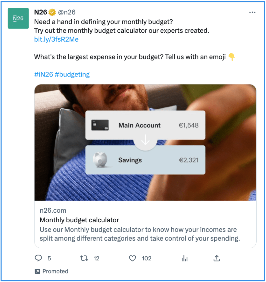
Another Twitter ad example from the book that convinces scrollers with not one but two strong calls to action.
Type of Ad
Promoting a Product Feature
Twitter Ad Creative
This ad creative says it all: using N26 allows you to lay back and smile, and managing your savings will be as easy as “drag and drop”. It further conveys that using the N26 app UI on the ad creative is a great way to build and support brand recognition.
Ad Headline
In three words, N26 communicates where clicking will lead you: to their monthly budget calculator. Although there’s no explicit CTA here, this headline is to the point and leaves no room for confusion.
Ad Text
N26 starts this ad with a question. If your answer is affirmative, you’ll keep reading. Questions are a great way to foster interaction, such as retweets and shares, or get peoples’ responses to a Tweet.
The formatting is clear, and so are both calls to action. Another plus point: N26 uses emojis sensibly without making the ad look ridiculous.
#3 EU HaDEA
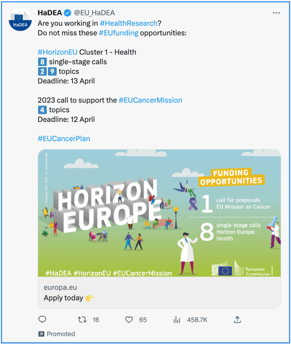
A cheerful ad creative to support a not-so-cheerful matter.
Type of Ad
Promoting Funding Opportunities
Twitter Ad Creative
This ad creative catches the eye with vibrant colours and a joyful allure. Only as you pause, the symbolism sinks in and, together with the text on the visual, make you realise that this is about cancer.
Ad Headline
Two words and an emoji make this call to action as clear as possible.
Ad Text
Well done! HaDEA did a great job at formatting this ad. It’s clear there are sufficient line breaks, so the numbers don’t overwhelm, and the little number emojis help differentiate the dates and deadlines from the number of calls and topics. All in all, these measures make the dense bits of information easier to digest.
The question at the beginning helps disqualify people outside HaDEA’s target group. Short sentences and relevant hashtags support possible sign-ups. Although we advised against using too many exit points in the best practice section of this article, in this ad, they serve as a source of information for interested applicants.
Applying for funding opportunities is clearly distinct from impulsive buying.
#4 LVRG Consulting
Another great ad example that looks like a personal Tweet at first.
Type of Ad
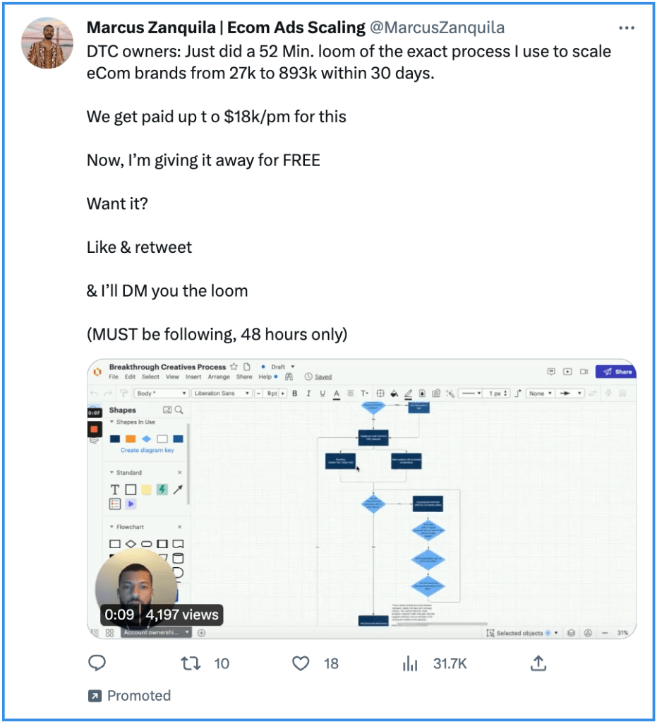
Promoting DM Giveaway
Twitter Ad Creative
This ad creative is a great choice. Why? There is a clear link between the ad promise and the content shown in the video. We got the speaker’s face in the bottom left corner and a convincing number of views right next to it.
Ad Headline
No headline, no problem: we can find all the information we need in the ad’s creative and text.
Ad text
Whoever stops scrolling at this post will immediately know whether this is for them. The ad does a great job targeting a clearly defined audience and discarding non-customers. They also allure with bold numbers and the classic freebie marketing strategy: offering a supposedly premium product or service for free to attract new customers.
No emojis here, but sensible line breaks and numbers that catch the eye. It’s all clearly laid out and easy to understand: you want the loom; you must help them promote their offer. A compelling Twitter ad example, we think.
#5 Apple
With this video ad, Apple does a great job promoting TV+ content. Let’s see which boxes they tick.
Type of Ad
Promoting a Service
Twitter Ad Creative
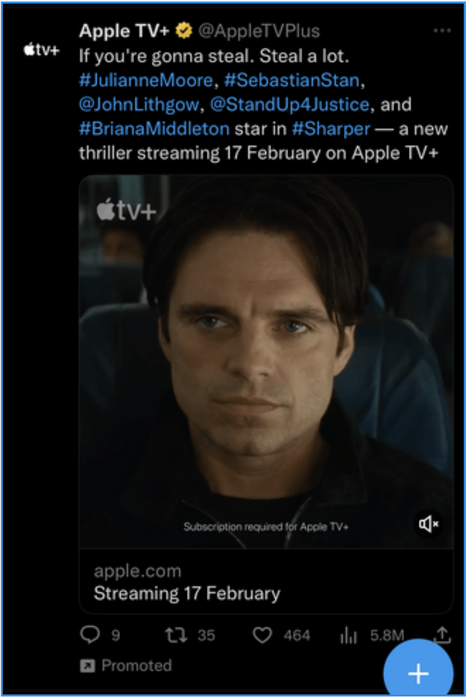
As humans, we are conditioned to recognise faces physiologically. Above all, a well-known face like Sebastian Stan is bound to be recognised. It helps that he’s attractive, too. What else does Apple do well? They repeat their logo throughout the ad. Amongst others, on the video.
Ad Headline
The headline is short, clear, and on-point, and gives consumers a valid cause to visit Apple’s website.
Ad Text
Great hook! The first two sentence fragments are, well, sentence fragments, which is great as it splits up the message and makes it stick. These bits are concise, too, and intriguing.
However, mentioning all the Hollywood actors in this one Tweet is a bit overwhelming.
We get that Apple wants to give the impression that whatever they’re streaming is great. Too many hashtags and mentions make for too many exit points and increase the likelihood that people leave the ad and check out the linked accounts instead.
#6 Dove “SpeakBeautiful” Twitter Ad Campaign
Old but gold! Dove’s #SpeakBeautiful campaign encouraged more than 50,000 Twitter users to promote positive body image and language on social media. They also partnered with Twitter to release a tool that analyzed users’ tweets and gave them real-time feedback on their tone. It’s one of the best Twitter ads for a reason!
Type of Ad
Hashtag Campaign
Twitter Ad Creative
By focusing on real data and promoting a positive, impactful message, Dove’s Twitter ad campaign spread awareness and encouraged more than 50,000 users to participate in an important social movement.
Ad Headline
Statistics are highly effective in driving emotional responses, and here, they emphasize how widespread online negativity is, making the need for action clear. “Let’s #SpeakBeautiful together” shifts from a problem to a solution, positioning Dove and the audience as allies.
Ad Text
The campaign resonated emotionally with users and aligned with Dove’s brand mission of promoting self-esteem. It was empowering, interactive, and social, creating a viral movement. It takes a more empathetic and solution-driven approach, motivating users to participate in creating a more positive and empowering environment online.
#7 Spotify
Every Spotify tweet shows how much they know their users and target audience. That’s why they easily get the conversations going with their Twitter ad campaigns.
Type of Ad
Engagement Ad / Conversation Starter
Twitter Ad Creative
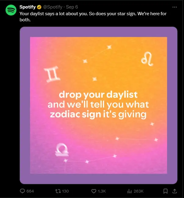
The background is a gradient of warm pink, orange, and purple hues with subtle zodiac symbols scattered across the image, creating a playful and trendy feel. The central text reads, “Drop your daylist and we’ll tell you what zodiac sign it’s giving,” inviting user interaction.
This creative serves a dual purpose: it encourages users to engage by commenting on their playlist (“daylist”) for a fun and personalized response from Spotify, and promotes their product.
Ad Headline
The headline uses a conversational tone, speaking directly to the audience and connecting two aspects of popular culture – music preferences (daylist) and astrology (star sign). This resonates with Spotify’s audience, particularly younger users who enjoy personalization and self-expression.
Ad Text
The ad text directly asks users to take action by “dropping” their playlist in the comments. This is a casual, fun way of encouraging participation and plays on the informal, social nature of Twitter. It’s easy for users to engage with a quick comment.
The phrase “what zodiac sign it’s giving” is playful and trendy. “Giving” is informal slang commonly used by younger generations on social media, further appealing to Spotify’s target audience.
The ad promises a personalized response, which is a strong motivator for users to engage. People enjoy seeing how their music tastes might align with something as personal as their zodiac sign, making it feel like a fun game.
The combination of a lighthearted headline and an engaging, personalized CTA makes this ad very effective. It speaks the audience’s language, plays on popular trends (music and astrology), and creates an easy way for users to participate, which increases engagement.
#8 Lidl
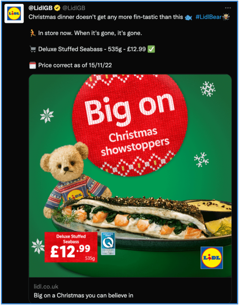
Lidl spent a big budget on this holiday season’s Twitter campaign to increase brand awareness.
Type of Ad
Brand Awareness Campaign
Twitter Ad Creative
This image screams Christmas: green and red dominate the colour palette, there are snowflakes, and a bear in a Sweden jumper sits behind the advertised special offer. This bear is Lidl’s primary brand asset over the holidays, and they do a good job promoting it.
Ad Headline
Lidl could have placed a call to action to their special offer in this part of the ad, but they decided to repeat their campaign tagline instead.
Ad Text
While the copy is clear and crucial data well-highlighted, we are left wondering what fin-tastic might mean. Nevertheless, this specific ad markets a limited-time promotion and successfully communicates a sense of urgency.
#9 Deity
A minimalist example of a Twitter ad that does well in a few points – and not so well in a few others.
Type of Ad
Promoting a Whitepaper
Twitter Ad Creative
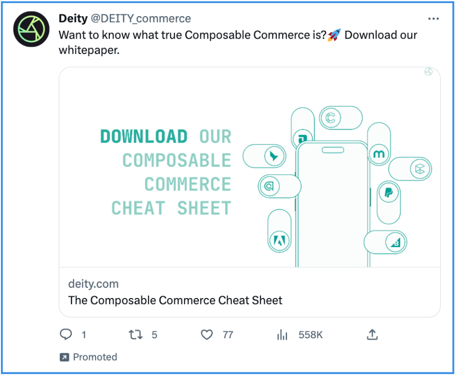
You might say this image attracts you with its minimalistic style, or you might call it bland.
Besides personal preference, this ad creative manages to communicate the idea of composable commerce quite well and reiterates the call to action.
Ad Headline
The alliteration is nice but doesn’t really stick. Using an actionable verb like “download” or “get” to repeat the call to action would have done better in this context.
Ad Text
The message is simple, unique, and manages to hook scrollers with a question at the beginning. This is good because anything that gets too complicated is easily overlooked on Twitter.
#10 Barclaycard
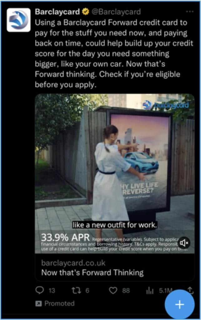
Do you have doubts about Forward credit? Barclaycard tries to remove them with this video ad.
Type of Ad
Promoting a Financial Product
Twitter Ad Creative
Video is a good thing on Twitter. On the one hand, it helps grab attention. On the other, we get the message even without reading the text. That helps because, in this ad, the text is not very reader-friendly.
Ad Headline
The headline is short and punchy but doesn’t actually say anything about the promoted product. Barclay simply used their tagline as an ad headline. Thus, one wonders where’s the call to action.
Ad Text
As mentioned earlier, the ad text could use some formatting. The sentences are too long, and there are no line breaks, emojis, and anything that would otherwise make it easy and fast for scrollers to take in the information.
#11 Cohere AI
CohereAI provides this ranking with a rather poor Twitter ad example. Let’s see why.
Type of Ad
Promoting a Blog Post
Twitter Ad Creative
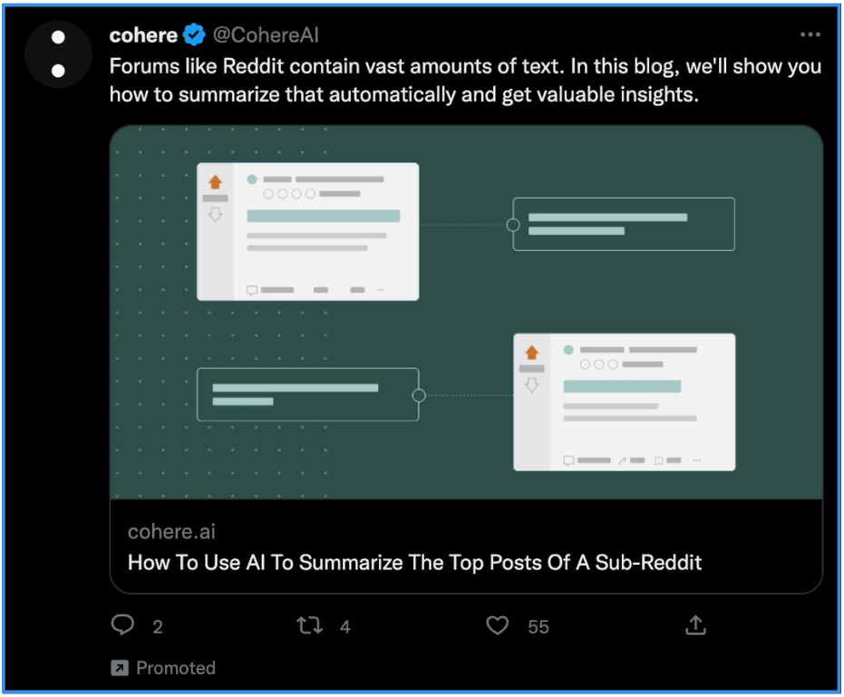
Images are usually a great way to stand out and attract attention. However, this image is rather generic and misses relating to the tweeted content. In other words, the image doesn’t mean anything and eventually is a large waste of space.
Ad Headline
The ad headline clearly states what the blog post is about. A more explicit call to action with an actionable verbal phrase like “see more” would have been nice and yielded a more significant impact.
Ad Text
This ad could use better formatting. Although there’s not much text overall, the sentences are too long and complex. Line breaks or clarifying emojis would make the information easier to read and dissect.
#12 Aspose
You wouldn’t expect this 90s ad on your 2024 Twitter timeline, would you?
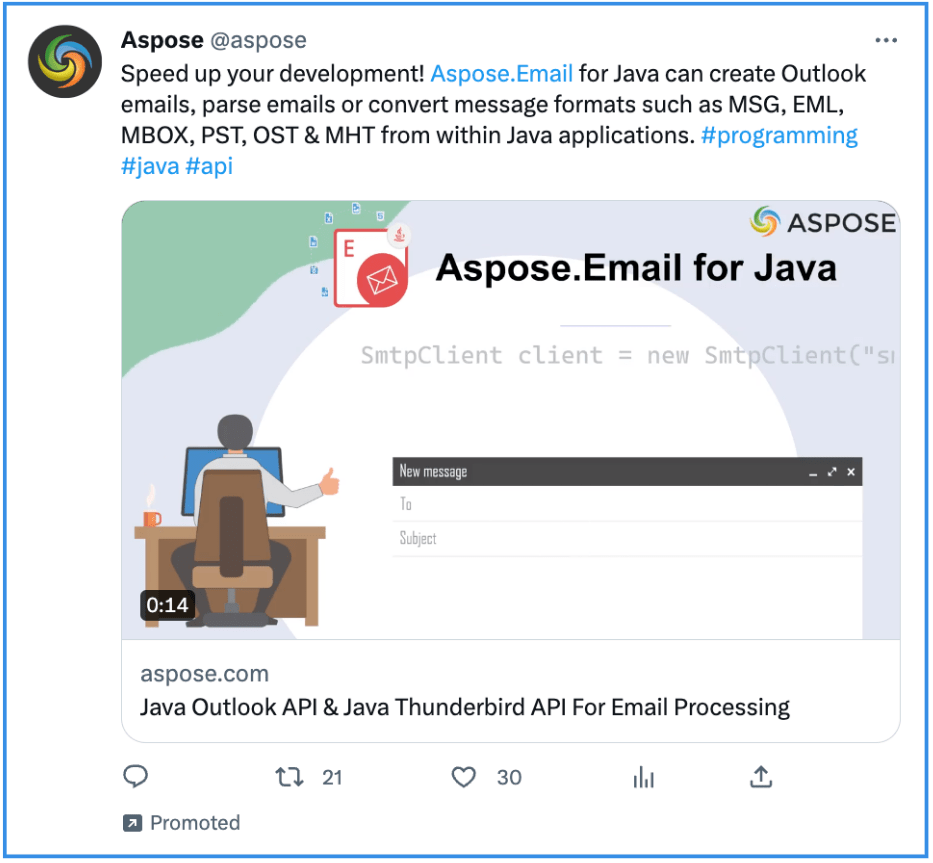
Type of Ad
Promoting a Product
Twitter Ad Creative
This creative would be better off on a CD-Rom cover to install Windows 98 than in this Twitter ad. It’s pretty bland, and the different elements are arranged randomly. It makes you wonder that was this done by a designer or by one of the developers themselves.
Ad Headline
Although a bit long, the ad headline describes the advertised product well.
Ad Text
The call to action in the first line is inconclusive and seems to drown in the rest of the text. This ad would have benefitted from shorter sentences and line breaks.
Concerning the hashtags, they are not particularly trending, meaning they won’t do anything to increase exposure. In our opinion, they are just unnecessary exit points.
#13 S&P Global Market Intelligence
A big player with a small ad.

Type of Ad
Promoting a Webinar
Twitter Ad Creative
None.
Ad Headline
None.
Ad Text
On top of the fact that this ad misses out on the visuals and the headline, the text is very poorly formatted: We are dealing with one single sentence that spreads over three whole lines and basically buries the call to action. If you ever stop scrolling to read this, dissecting the information will take considerable time. As a Twitter user, you will most likely overlook this ad.
Top 3 Best Twitter Ads
Let’s go back and take a quick look at three of the best-performing Twitter ads and why they stand out.
What do they have in common?
These top ads effectively combine creativity, clear messaging, and strong CTAs to drive engagement.
#1 NUOPTIMA
Ad Type: Promoting a Webinar
This ad brilliantly blends expertise with a personal touch, using conversational language and social proof to attract sign-ups for a free SEO webinar. Its native tone and bold promise make it one of the best Twitter ad examples.
#2 N26
Ad Type: Promoting a Product Feature
With its minimalist design and effective use of app UI, N26’s ad creatively communicates how simple budgeting can be. A question-based opening fosters interaction and sparks interest.
#3 EU HaDEA
Ad Type: Promoting Funding Opportunities
Bright visuals with a contrasting message on cancer funding make this ad eye-catching and impactful. Well-organized text and strategic line breaks make it easy to digest dense information.
Want your ad to appear in the best Twitter ad examples?
