Key Points:
- The most effective LinkedIn ads manage to capture users’ attention and boost engagement to then drive traffic and generate leads. The best four have been highlighted below:
- Monday – With a cunning strategy, Monday not only grabs the attention of project managers (and holds it) but also provides valuable insights that drive engagement on the platform. Following their call to action, readers get a free e-book to discover how to soar their ROI.
- Figma – Figma’s LinkedIn ad catches the eye with its unique design and a client case study of urban mobility giant Uber. Using bold colours drives brand awareness, while a clear call to action entices readers to learn more.
- Notion – Notion’s ad targets leaders in Engineering, Product, and Design and offers a solution to make collaboration easier. The ad’s design and a free demo promise better and faster results with ease.
- Stripe – The fast-paced, attention-grabbing video with a bold soundtrack and clear titles uses bright contrasting colours that make it impossible to scroll past. By clicking on the ad and following Stripe’s call to action, businesses can learn how to improve their checkout process and retain more customers.
Are you finding it hard to stand out from the crowd on LinkedIn? With so many businesses using the platform to reach their target audience, it can be challenging to create ads that truly capture the attention of your potential clients. However, creating great LinkedIn ads is crucial for reaching B2B clients, building brand awareness, and driving conversions.
This article will showcase 11 of the best LinkedIn ads examples to inspire your next campaign – whether you’re a B2B business, a startup, or an established company. We will also analyse why those ads perform so well.
Best LinkedIn Ads Examples
As highlighted earlier, in the world of LinkedIn advertising, it’s all about standing out in a sea of competition. But what sets the truly successful ads apart? In this chapter, we dive deep into the strategies and tactics used by some of the top-performing ads on the platform:
1. Monday
Looking for a way to take your project management to the next level? Look no further than Monday, which promises to deliver the secrets to success with a free e-book. This Linkedin single-image ad with its bold font, striking colours, and catchy headline immediately grabs the attention.
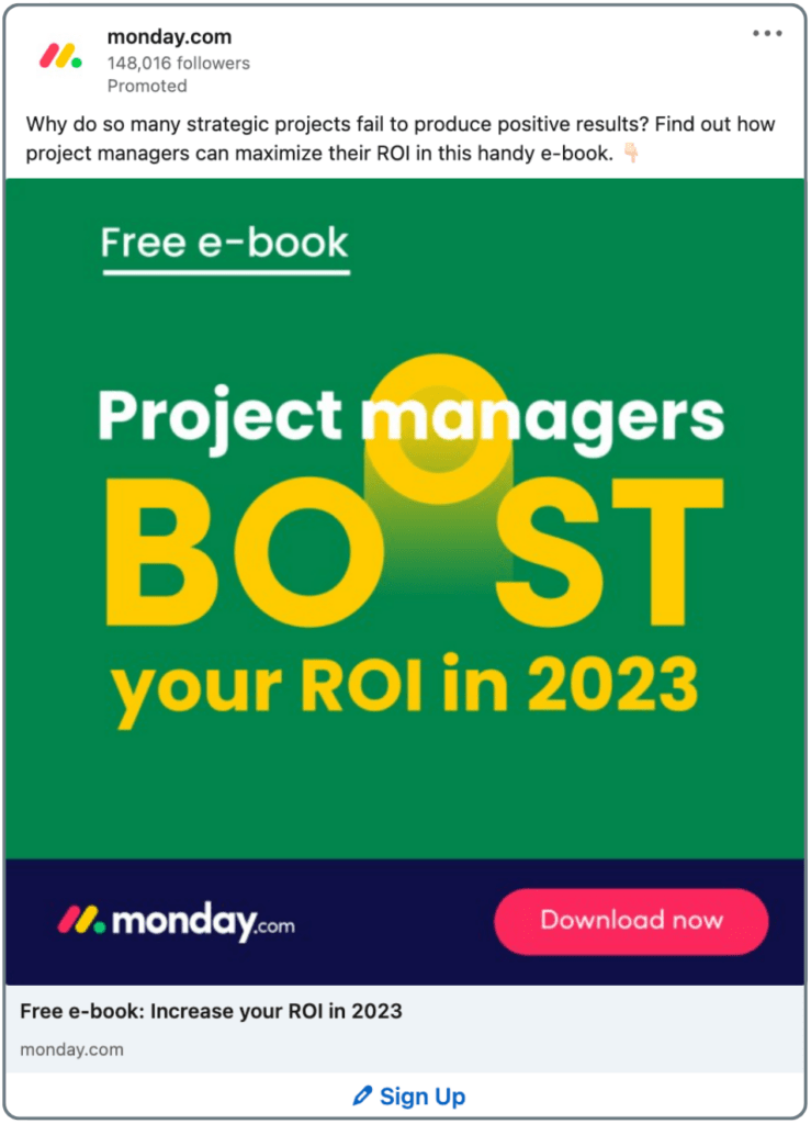
Now, if you’re a project manager and afraid of falling short of delivering positive results, you will most likely not scroll past this. Instead, you will follow Monday’s call to action, leave your contact details, and sign up for a free e-book to discover how to skyrocket your ROI.
2. Stripe
As an e-commerce operator, nothing is more frustrating than watching customers abandon their carts at checkout. So, if you’re tired of losing customers during checkout, Stripe is the solution you’ve been looking for. Stripe’s latest LinkedIn video ad example is a fast-paced, attention-grabbing creation with a bold, groovy soundtrack and clear, compelling titles. The bright, contrasting colours make it impossible to scroll past.
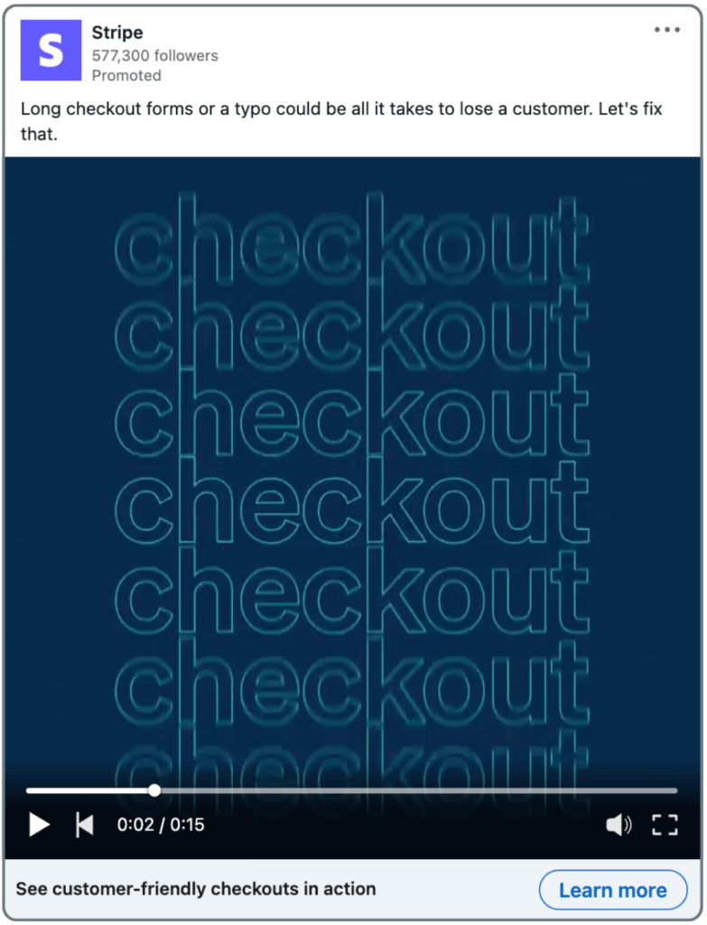
By clicking on the ad and following Stripe’s call to action, you’ll learn how to improve your checkout process and retain more customers. In exchange for your contact information, you’ll gain access to examples of customer-friendly checkouts that will make it easy to improve your own checkout process.
One key takeaway for your own campaigns: Write like Stripe. They masterfully craft concise yet descriptive copy that packs a punch in under 70 characters. This is a key element to their success, as longer descriptions can get truncated on the desktop. As such, Stripe’s LinkedIn video ad is a shining desktop example.
3. Figma
This LinkedIn text ad is a prime example of how to use a combination of vivid colours, compelling design, a case study from a well-known unicorn company, and a clear call to action to drive engagement on LinkedIn. The fountain pen tool, a key component of Figma’s user interface, strengthens brand awareness and entices readers to learn more by clicking through.
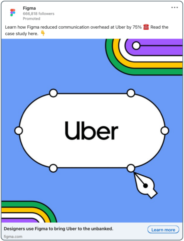
Figma tells readers about a frustrating prototype testing process at Uber and how their solution eventually enabled teams to collaborate seamlessly on the same design in real-time. Hence, Impressive case studies like this are a great way to build trust and generate new leads.
4. Grammarly
In their latest LinkedIn video ad, Grammarly boasts about how they helped Zoom’s IT department save a whopping 7,000 hours on writing and written communication. Impressive, right? Imagine Grammarly as a superhero sidekick for content creators that swoops in to streamline your workflow.
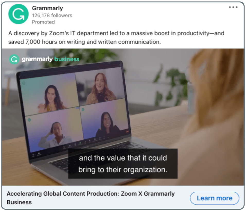
In this video ad, Grammarly shows how it can ease the pain of content creation, make communication more effective and ensure every word is on point and polished. It’s like they’re saying, “You can have your cake and eat it too” – quality and speed, all in one package.
5. Notion
This sympathetic, simple single-image ad promises faster and better results for leaders in the Engineering, Product, and Design fields. Are you one of them? Then you know that collaboration is crucial but often a pain.
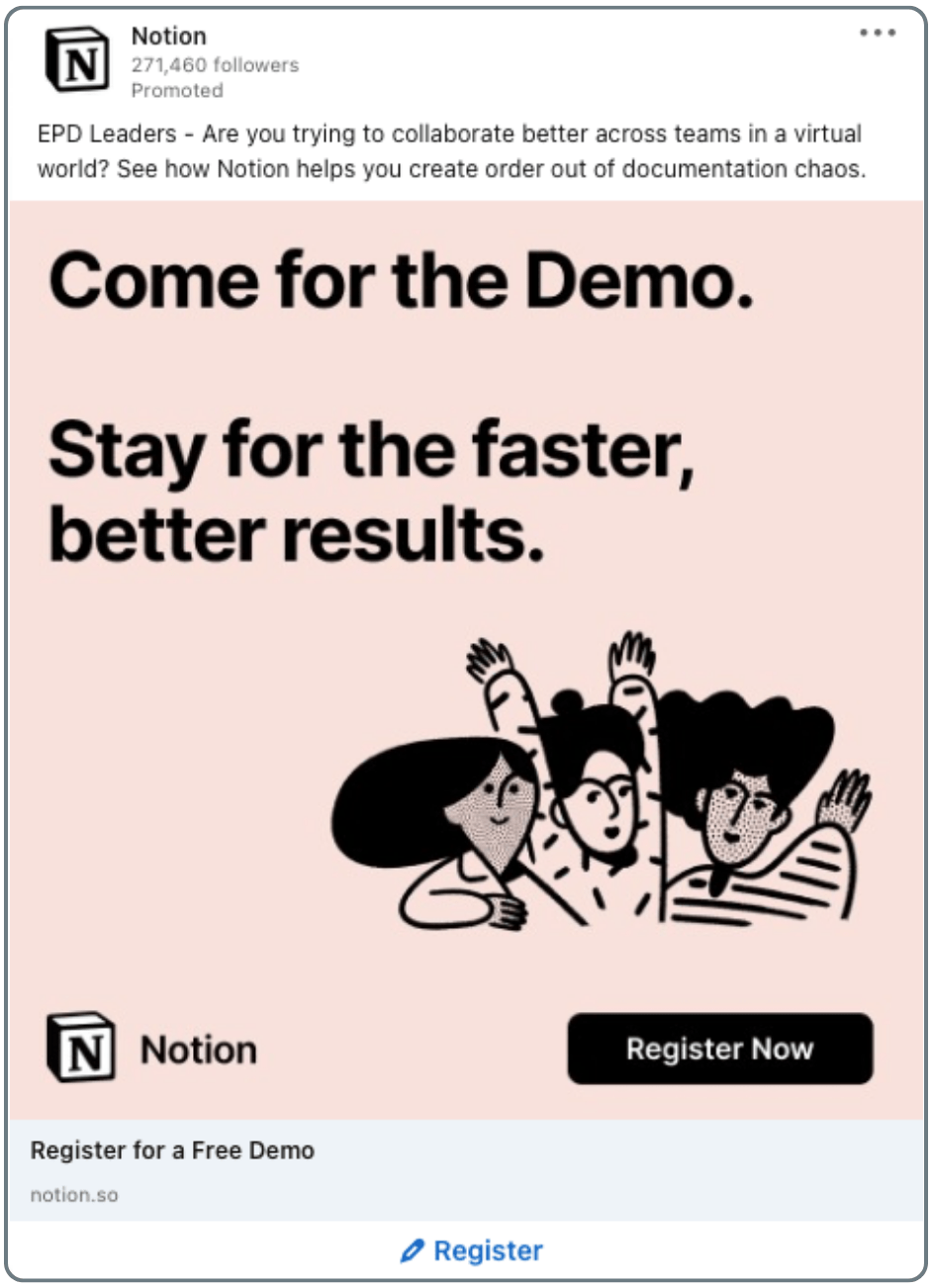
So, who wouldn’t jump at the opportunity, especially with a free demo on the table? Upon registration, you’re asked to leave your email address – LinkedIn automatically fills in the rest. This makes for an efficient first experience, leaving you with the impression that using the product will be just as seamless.
6. LaunchDarkly
This LinkedIn conversation ad is a prime example of precision targeting delivered straight to your inbox. It addresses you personally and starts off by highlighting the benefits for you, such as a complimentary lunch and a free demo. Yes, tell me more!
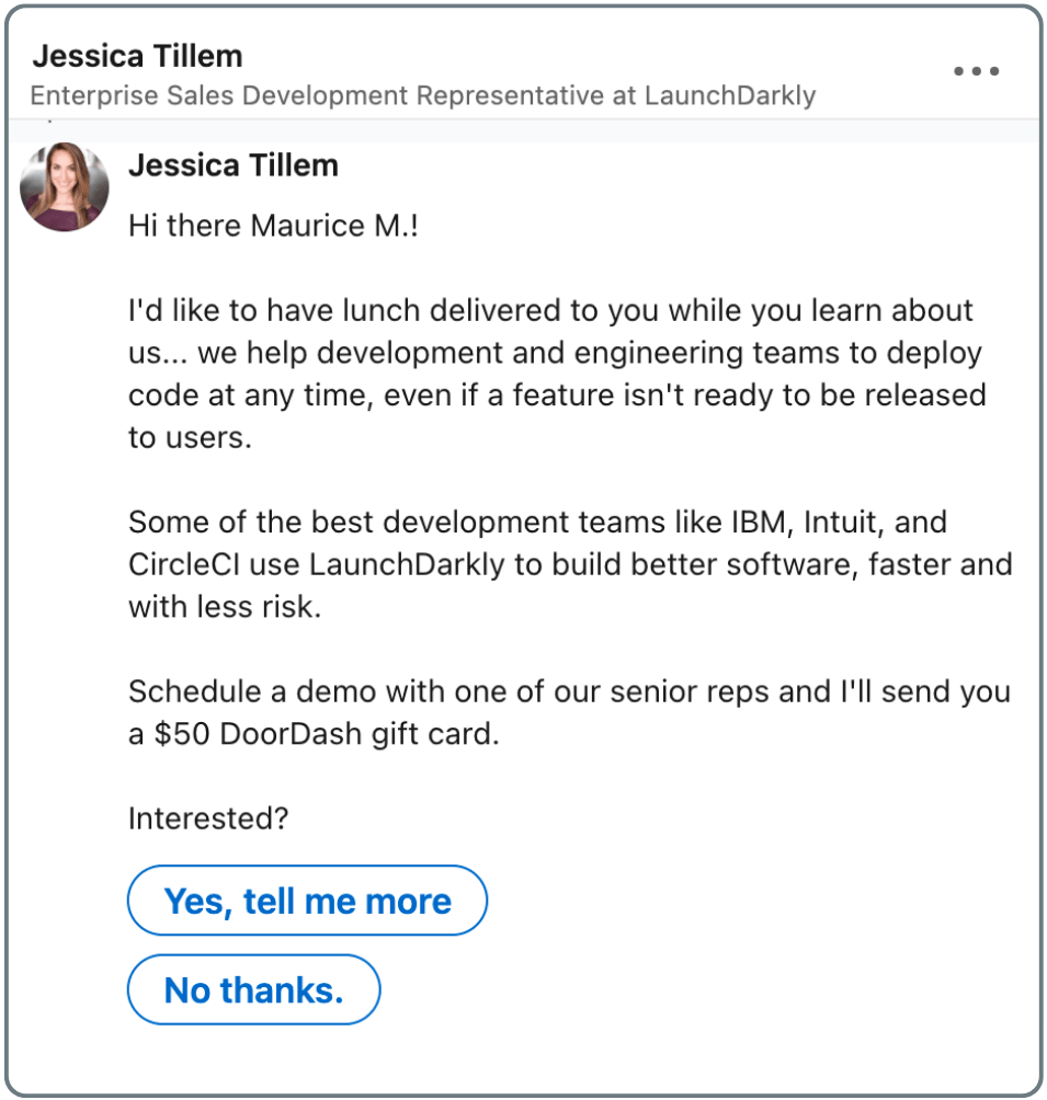
The results of this campaign were nothing short of astounding, with an open rate of 74%, a click-to-open rate of 11%, and a low cost-per-lead of $131. Most importantly, this campaign generated $60,000 in the pipeline, all while keeping the total spend at around $4,000. An amazing LinkedIn conversation ads example!
7. WeWork
This LinkedIn carousel ad example immediately catches the eye. Each slide lets you discover more of WeWork’s inviting office interior. The images are so convincing you’ll be ready to sign up before you even read the caption.
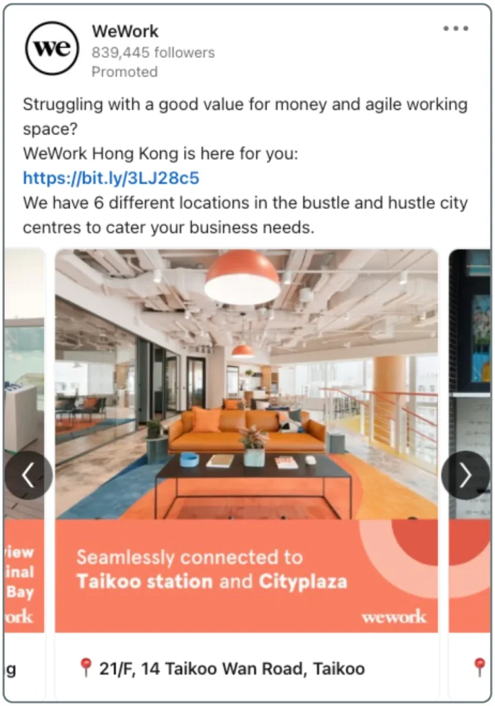
The limited-time offer and clear call to action create a sense of urgency. If you’re seeking office space, this will surely motivate you to take action and hit that sign-up button before the deadline.
8. Adobe Creative Cloud
Adobe masterfully captures your attention with this humorous ad and then reels in those who can relate to the pain point. Are you a creative director? Yes? Then you must feel like the guy in this illustration – chained to your computer, on a wild goose chase for the perfect stock image, and ready to throw in the towel.
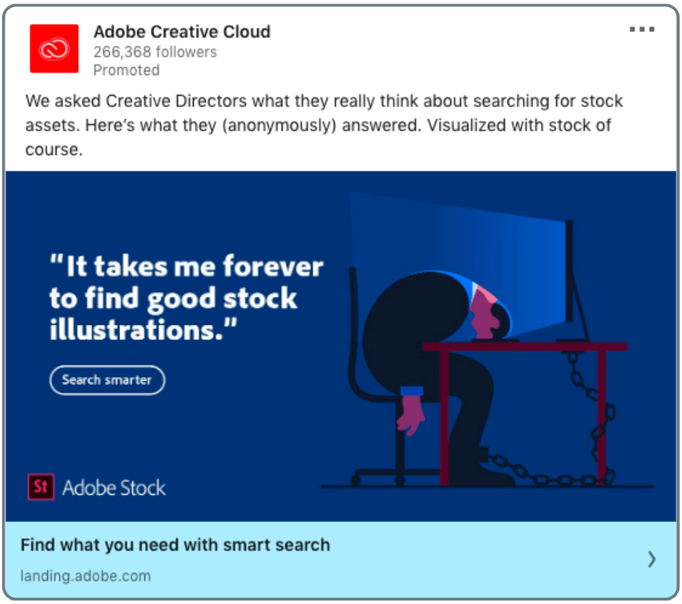
If you can relate, you will be seeking a solution. As you click on the ad, you are directed to Adobe’s website, and voilà: With Adobe Stock, the perfect image is just a click away. If you can’t quite relate, Adobe still manages to convince you. They use a quote from an internal survey for increased credibility and thereby showcase the significance of the issue at hand.
9. Nuoptima
This LinkedIn post might seem unusual as to its visuals, and it’s such an eye-catcher! The meme intrigues and grabs your attention. This webinar offers you great value if you’re running an SEO strategy for your website or business!
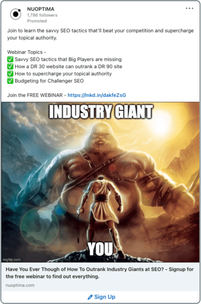
Nuoptima piques the curiosity of B2B readers by directly addressing not one but four(!) SEO pain points in this post and giving their services for free. Removing barriers to entry with free offerings is an excellent strategy for attracting interested readers who would otherwise resist joining in the first place. Nuoptima obtained over 300 sign-ups for this webinar, making this LinkedIn text ad yet another outstanding example of how to capture attention and increase interaction.
10. Apple
The bright green highlight immediately catches the eye and communicates the ad’s focal point: Mac’s unbeatable data security. The sleek, minimalistic design of this single-image ad speaks volumes about the value proposition – security and convenience in one package. So if you’re looking for a hassle-free experience, Mac is the way to go.
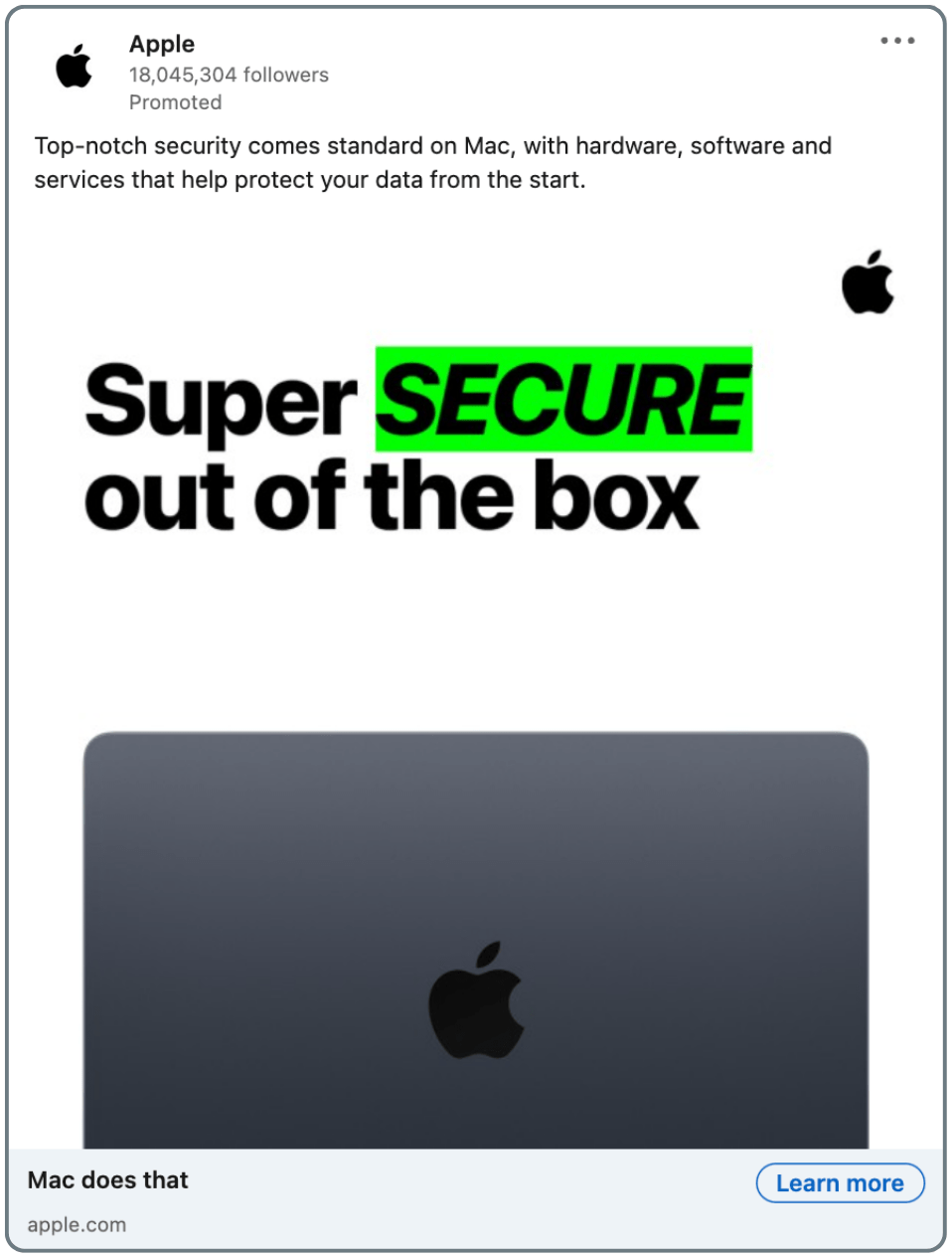
Because honestly: Who wants to waste hours installing antivirus software or dealing with the headache of data loss caused by pesky viruses? In this case, “Think Outside the Box” is more than just a clever phrase. It’s a philosophy that embodies Apple’s reputation as a game-changer in the industry.
11. LinkedIn Ads
Imagine a collection of spectacular LinkedIn ads examples without one from LinkedIn Ads themselves. Yes, quite impossible. The design of this carousel ad is simple yet striking, with a large font size that immediately captures your attention. The core message is clear: £100 ad credit, free for the taking. Who wouldn’t want free ad credit for their business?
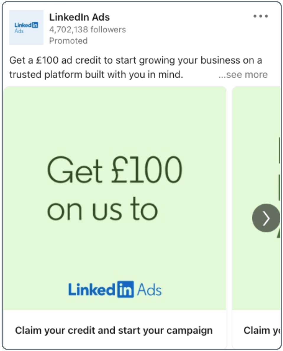
As we scroll through the carousel, we’re presented with a series of catchy phrases like “B2Build better ads,” “B2Boost your ROI”, and “get B2Bigtime results”. The clever wordplay is both engaging and inviting, encouraging readers to click through until the end.
LinkedIn Ads knows how to generate leads, and this ad is no exception. All it takes is leaving your email address to receive the credit. This LinkedIn carousel ad is a shining example of how to use an irresistible offer, a dash of humour, and a clear call to action to keep users engaged and drive action.
What Makes Those Ads Perform So Well?
As we delved deep into the realm of LinkedIn advertising, we discovered that certain strategies and tactics consistently stood out as the best ways to make a big impact on the world’s largest professional network. While the following list is by no means exhaustive, it shines a spotlight on the most common and effective methods employed by top-performing LinkedIn ads.
Copy
Copy is the backbone of any ad. It’s the message you want to convey and the words that will convince your target audience to take action. If you strugle with this part you can hire a LinkedIn ghostwriting agency. This section looks at the most effective copywriting strategies for maximising your impact on LinkedIn:
- Short Headlines – Grab attention with catchy headlines. Try to keep them as simple as possible.
Example: Get £100 from us.
- Concise Copy – Keep the message clear and on point. Less than 100 characters are best.
Example: Long checkout forms or a typo could be all it takes to lose a customer. Let’s fix that.
- Snappy Tagline – Create a memorable phrase that sums up your brand.
Example: Mac does that.
- Clear Call to Action – Make it easy for readers to take the next step.
Examples: Sign up, learn more.
- Strong Value Proposition – Show the unique benefits of your product or service.
Example: Claim your credit and start your campaign.
- Use of Action Verbs – Encourage readers to take action.
Use verbs like register, download, learn, claim, etc.
- Use of Quotes – Add credibility and social proof.
Example: “It takes me forever to find good stock illustrations.”
- Use of Statistics – It is proven that statistics do especially well in ads. Why? Numbers catch the eye, convince the reader naturally, and add credibility.
Example: Learn how Figma reduced communication overhead at Uber by 75%.
- Addressing the Audience Directly – Make a personal connection with readers.
Example: Start growing your business; WeWork Hong Kong is here for you; EDP Leaders, are you trying to collaborate better across teams?
- Give advice, Guidance, or Provide insights – Share your expertise and add value.
Examples: free e-book, ad credit, free webinar, or demo.
- Sense of Humour – Add some personality and make your brand more relatable.
Example: We asked Creative Directors what they think about searching for stock assets: “It takes me forever to find good stock illustrations.” Visualised with a stock, of course.
- Client Case Studies – Share real-world examples of how you’ve helped others succeed.
Example: Designers use Figma to bring Uber to the unbanked.
Design, Layout, and Sponsored Content
Design and layout can make all the difference in the effectiveness of your LinkedIn ad. From utilising engaging video content to paying for LinkedIn sponsored ads, in this section, you’ll learn how to stand out.
- Video Content – Video content gets up to five times more engagement. Also, they generally hold viewers’ attention for longer.
- Carousel Ads – Carousel ads are a great way to tell an interactive story – especially when one large picture is divided between three slides of a carousel, it can tell a story or offers statistical facts. Combining key numbers with graphics is another great way to catch readers’ attention.
- Bold Colours and Big Font – Using bold, bright colours and large fonts in your ads can make them stand out and grab attention.
- Appealing Visuals – Using high-quality, visually appealing images and graphics in your ads can make them more engaging and increase the chances of them being clicked on.
- LinkedIn Sponsored Ads – Sponsored ads can be a game-changer for businesses looking to boost their visibility on LinkedIn, as they allow gaining insight into the demographics of their target audience. Businesses can use their LinkedIn sponsored ads as an example of how to create high-performing ads, increase brand awareness, and generate leads.
