The number #1 goal for every SaaS company is to be profitable, and one of the most important metrics that measure profitability is the conversion rate. What is a SaaS conversion rate?
A SaaS conversion rate is the percentage of readers who have completed a desired action. Usually, for most SaaS companies, the desired action is either when a website visitor signs up for a free trial or when a free trial user starts paying for the product.
However, there are eight types of conversion with different benchmarks, which we outlined below. Apart from average conversion rates, in this article, you will learn more about mistakes that affect conversion rates and conversion rate optimization strategies.
Average Conversion Rates for SaaS Businesses (Benchmarks)
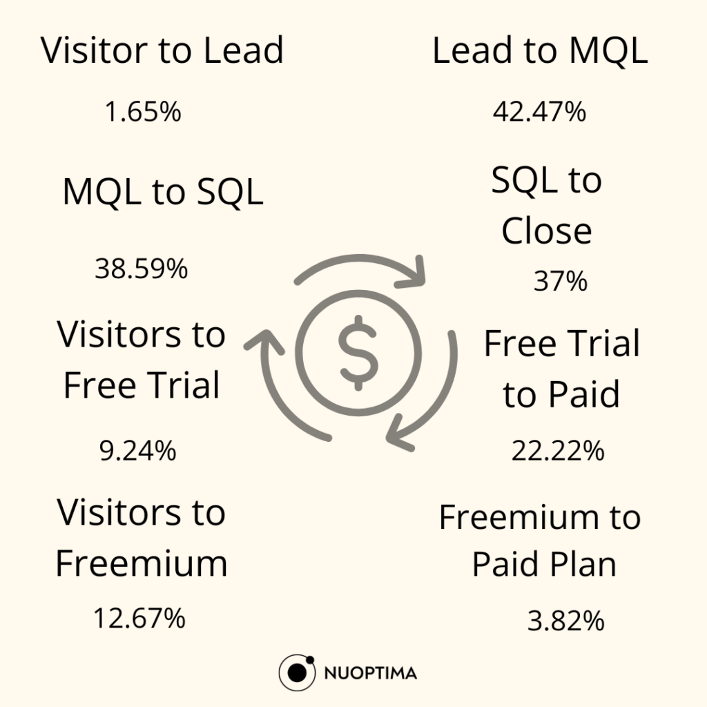
Based on the average SaaS conversion rates report [1], which summarized data from 50+ B2B SaaS clients, there are eight types of conversion. Let’s see what are the average numbers for each of them:
1. Visitor to Lead
This conversion type measures the percentage of website visitors who sign up for a lead generation form, such as a newsletter or a sales contact form.
The average conversion rate is approximately 1.65%, which means out of 100 website visitors, 1–2 convert on average. A good conversion rate would be having 5+ leads out of 100.
2. Lead to MQL
A lead becomes a marketing qualified lead when they’ve engaged with marketing content, such as downloading a whitepaper or attending a webinar. MQLs are considered more likely to convert to paying customers because they’ve shown more interest in your product, therefore, the average conversion rate should be higher.
The average conversion rate from a lead to an MQL is 42.47%, so out of 100 leads, around 43 would become MQLs. If you are meeting or exceeding these average numbers, you have an excellent conversion rate.
3. MQL to SQL
A step up from MQL would be SQL (sales qualified lead), a lead that has demonstrated a clear intent to purchase, such as requesting a product demo, comparing pricing, or discussing specific use cases. A prospect who has downloaded a case study, attended a webinar and then requested a sales call would be considered an SQL.
The average conversion rate for this type is 38.59%; to meet this benchmark, out of 100 MQLs, 39 should become SQLs.
4. SQL to Close
The fourth conversion type focuses on the number of sales-qualified leads that have become paying customers. The average conversion rate, according to the SaaS conversion rates report, is 37%. If you have 37 paying customers from sales leads, you are meeting the average conversion rates.
5. Visitors to Free Trial
Not all SaaS companies have lead-generation strategies and funnels in place. If you don’t have a long SaaS sales process that includes lead magnets and sales calls, then you probably acquire customers through a “Sign up for a free trial” CTA.
According to the study we mentioned above, the average conversion rate for free trial sign-ups is approximately 9.24%. With an average of 1000 monthly website visitors, to meet the SaaS industry benchmark, you should have around 93 sign-ups.
6. Free Trial to Paid
One of the main goals of SaaS brands is to attract potential customers via a free trial and, after showing the value of their product, convert them into paying customers.
Since it is much easier to convince someone that your product is for them after they’ve tried and found value in it by themselves, the average conversion rates are higher. Tverage rate is 22.22%, so if you have 93 free trial users, you should aim for 22 of them to become regular paying customers.
7. Visitors to Freemium
Some SaaS companies don’t have free trials but freemiums. A freemium is a forever free plan that, unlike a free trial, doesn’t have a time limit but usually has other limits. These limits vary from the number of people on the plan (limited to 5 people) or no extra features.
On average, freemiums have a higher conversion rate (12.67%) than free trials since users can test the tools and use them without a time limit. But, data and our experience show it is harder to convince a free plan (freemium) user to become a paying customer.
8. Freemium to Paid Plan
If you are having trouble convincing your free plan users to sign up for a paid plan, you are not the only one. In fact, the conversion rate for free to paid plan users is 3.82%.
However, with good strategies, companies convert freemium users; Slack has a conversion rate of 30%.
What is a Good SaaS Conversion Rate?
A universally good conversion rate for SaaS brands lies somewhere between 20.95%. However, it is not helpful to benchmark your conversions with this universal one, but keep track of the specific type of conversion and compare it to the industry standards for that type and other companies that are at the same level (start-ups vs enterprise).
We outlined the different conversion rate types as guidelines, but you can also benchmark your performance with Databox’s benchmark group[2]. You can connect your data and see how you perform compared to other similar SaaS companies for free.
How to Effectively Measure Your Conversion Rates?
If you don’t want to benchmark your data according to other competitors, you should at least regularly keep track of and optimize your conversion and digital marketing strategies based on real data.
You can measure how many people performed the desired action (clicking on “sign up for a free trial, for example) by configuring an event on your Google Analytics 4.
To set up an event in GA4, you need to go to Google Analytics and sign in with your Google account. After choosing the GA4 property where you want to set up the event, click on the Admin gear icon.
Under the Property column, click on Events >> Create event >> Give your event a name. Then, you need to define the value of the parameter and the condition when the event should be triggered – “event name” is equal to “event condition.”
For more advanced settings, you need to use Google’s Tag Manager to create the configuration tag. Finally, you need to click on Tag configuration and connect to the event you created before.
With Tags Manager, you can create highly customized triggers for events based on specific conditions (e.g., clicks on particular elements, form submissions, scroll depth). This is one of the most important things for B2B SaaS analytics.

4 Mistakes that Affect Conversion Rates
According to the 2023 analysis of factors influencing website conversion rates [3], there are 6 mistakes websites make that are costing them conversions.
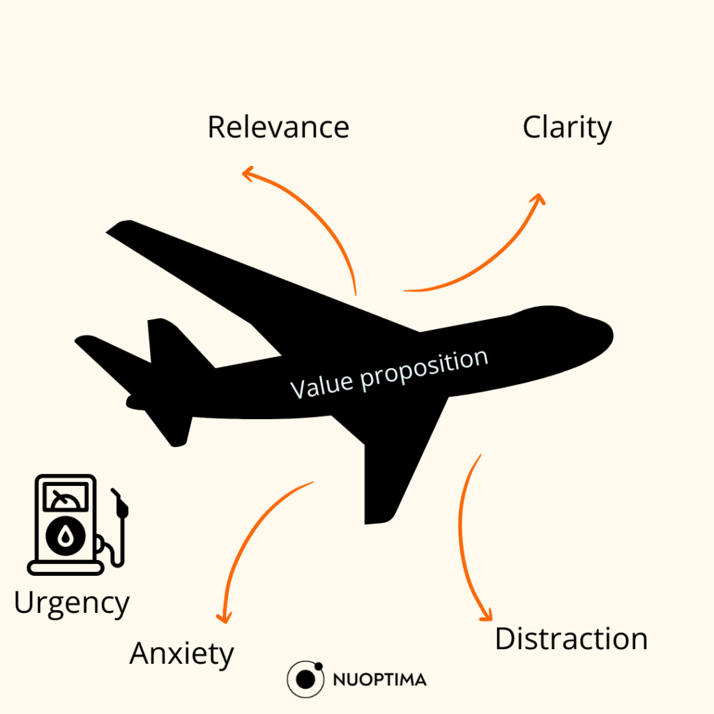
All major mistakes SaaS companies make that may block their conversions can be summarized in these four categories below. Take a close look and check if you are making these mistakes:
1. Low Visibility
Traffic and conversions kind of go hand in hand – without traffic, you can’t have conversions. So even though your SaaS landing page is set up properly, if nobody sees it, you won’t have conversions.
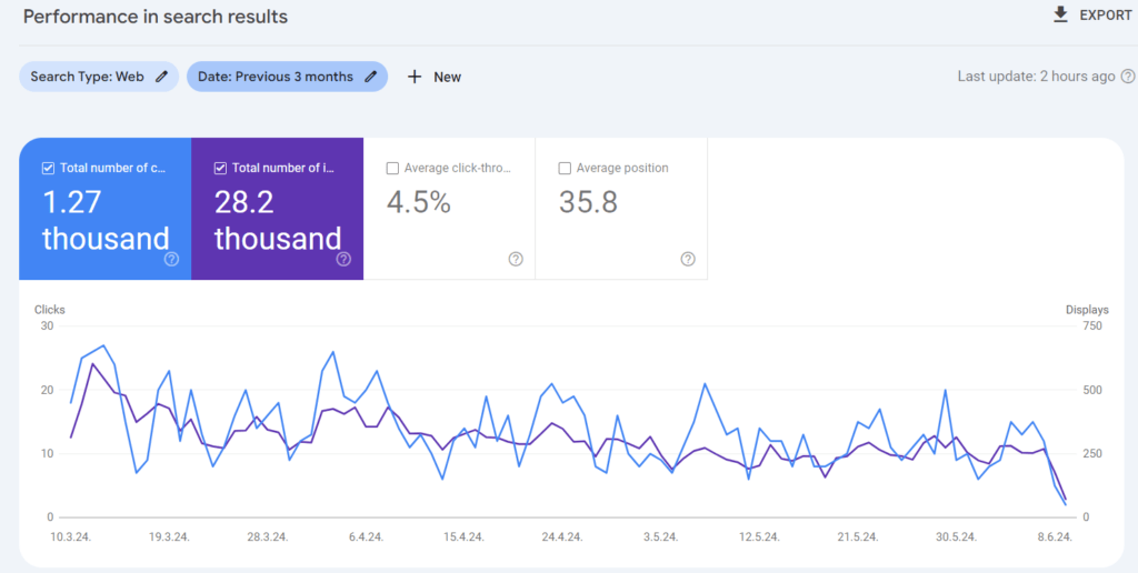
Therefore, the first metrics you should track are impressions and clicks (on Google Search Console). To appear in many different relevant SERPs, you need to rank for keywords (check on Ahrefs).
If you are ranking for a few keywords and aren’t receiving a lot of traffic to your website, then conversion shouldn’t be your top priority. With proper content marketing strategies, you can work on bringing more visitors and potential leads to your website.
2. Unclear Communication
If you have website visitors but they aren’t turning into leads or paying customers, the #1 problem is that they aren’t convinced.
This usually happens if your communication is unclear, in the sense that they don’t know the value they get from your software. Sometimes, they don’t even know what your software is about. Make sure to cut down on fancy words and make sure anyone who lands on your website can quickly assess if they are in the right place.
Phrases such as “We are an innovative tool that will help you skyrocket your marketing efforts” don’t tell a lot about your features and target audience.
Another common case is that the reader isn’t guided towards making a purchase decision. SaaS websites have a typical website outline, and sometimes, the flow doesn’t direct readers in the right way.
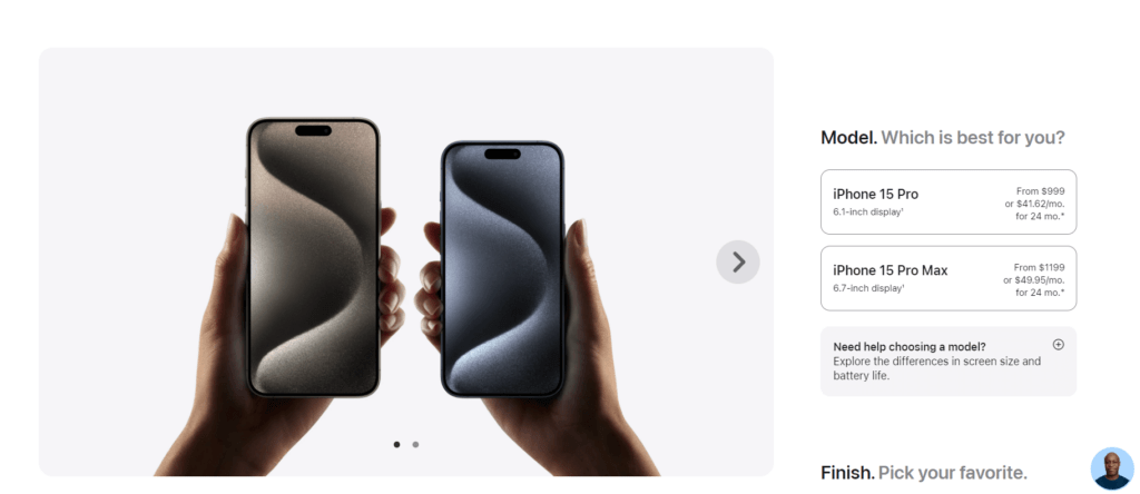
Apple’s shop is a great example that SaaS brands can copy paste – offering a “need help choosing a model” option besides the purchasing options.
Another example is when the visitors land on your website, and after seeing the features, they are directly taken to the CTA. But the reader isn’t convinced with use cases and social proof that they should pick your software over others.
The main component missing there is trust – in a world where we are populated with tools and ads, we are getting more and more untrustworthy.
Therefore, the path from a visitor to a paying customer is most likely not linear step 1 – step 2, but with numerous steps in between (comparing the tool, viewing the blog, reading the FAQs, checking the pricing packages, reaching out to the support team, etc).
So make sure all these in-between steps are clearly outlined and that each one of them has a CTA, so no matter when your customers are ready, they can easily buy.
>> Learn more about SaaS customer journeys<<
3. Poor Website Layout
The last sentence leans into the #3rd mistake SaaS companies make – the customer can’t find their way around the website. They can’t easily navigate toward more information on specific features or payment options once they are in the blog section, for example. This can easily be fixed with a menu, relevant categories and links.
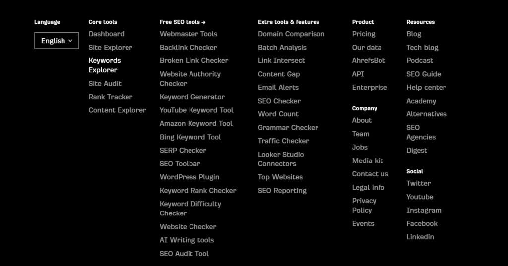
Apart from your SaaS website being intuitive, it needs to be user-friendly in the sense that there aren’t too many distractions for the reader. Too many flashy pop-ups or different CTAs could confuse the reader. If you give them too many options, they will most likely feel overwhelmed and bounce.
In most cases, the options should be to “learn more” or “to buy,” and your copy and UI design should always reflect that.
4. Limited Options
If you see your “cart abandonment rate,” aka the people who leave once they are at the final step of their purchase journey, that probably means they have some doubts related to payments.
In most cases, those doubts are due to limited payment options or pricing plans. For example, on Quora, many have highlighted the issue of having only the card option for ChatGPT +.

Or for example, some tools offer only annual subscriptions, so customers who want to try the tool for a month have a problem with this. Another example is when SaaS businesses don’t offer a lower tier for customers who want only one feature or have a smaller team/business.

6 Conversion Rate Optimization Strategies
Now that you know your North Star (the average conversion rate) and the top mistakes SaaS companies make, let’s review some proven strategies that can help increase your conversion rates. In the end, we will show how you can test these strategies and see if they’ve affected your user experience and SaaS ROI.
1. Write Better Copy
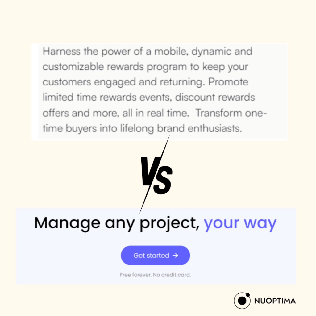
The number one mistake is overloading your website with copy and visuals so that the website visitor needs to spend a lot of time figuring out where they are and what they need to do.
Take a look at the example below to see how five words can convey a message better than one paragraph. Since our attention span is decreasing more and more, we need to be short and concise.
A website saw a 139% increase in the number of clicks on the “Try it now” buttons once they’ve changed the CTA, shortened the homepage copy, and started using words their customers used when searching for their products online.[5]
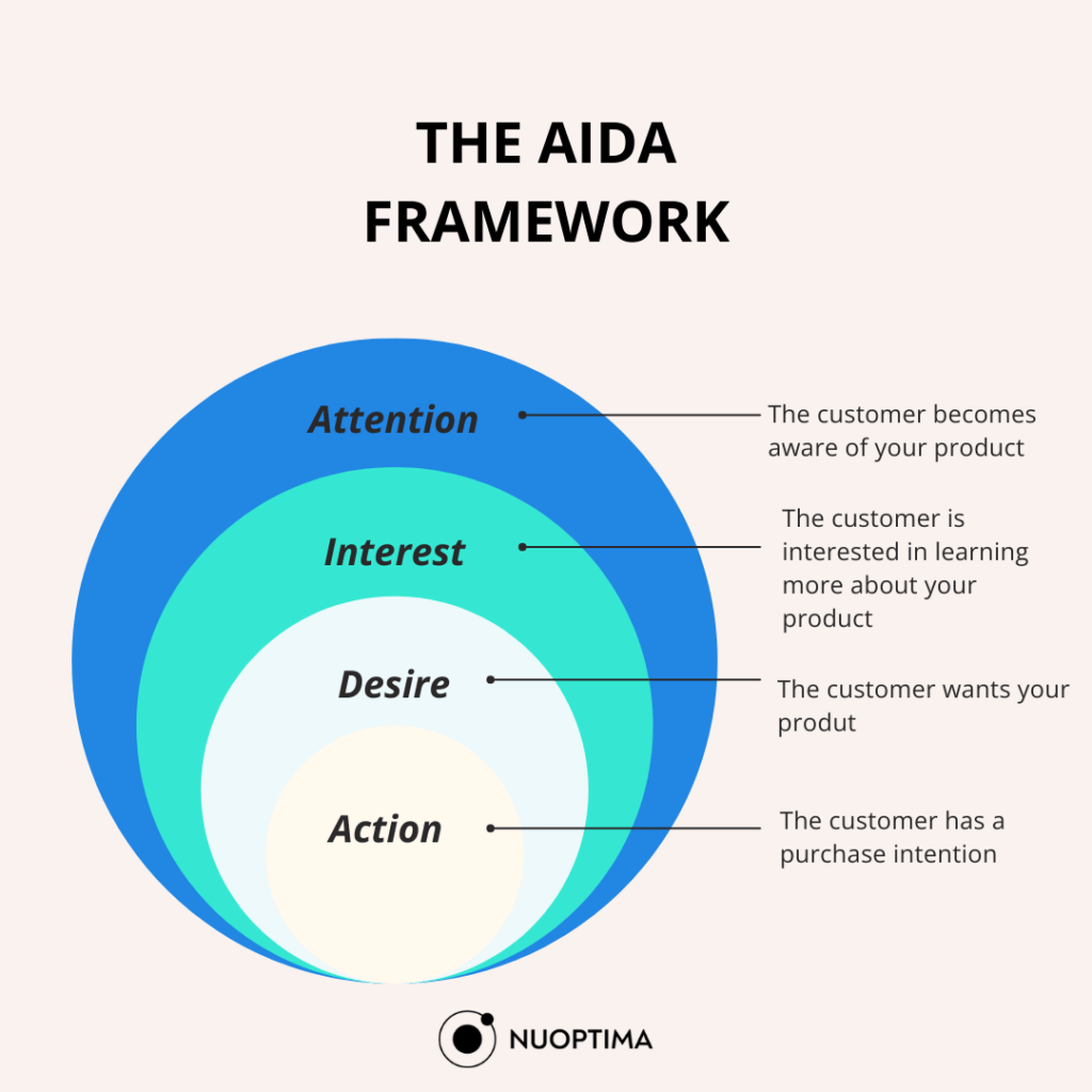
You can follow the most popular AIDA model if you want to revamp your copy:
2. Compare Your Tool With Competitors
The second piece of advice that can immediately clear your lead’s doubts is a direct comparison. Hey, your leads are going to do it anyway, so you might as well save them some time and use the opportunity to highlight your competitive advantages.
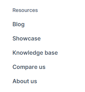
Have a “Compare Us” page and use it to honestly review your competitors in terms of features, pros, cons and use cases in contrast to your tool. Don’t be afraid to be worse than your competitor in some regards, but highlight their gaps and explain how your software fills them in.
For example, maybe they have extra features but a limited number of people per account, if you offer unlimited seats, direct your copy and CTAs toward converting people who need the unlimited seat options.
3. Ask for Minimal Commitment
Rarely customers will commit to a paid plan without seeing a demo, or having a free plan, especially if the paid plan is expensive. If you see that people aren’t signing up for your free plan, you need to offer a minimal commitment, such as a free plan or trial.
Good tactics people use to convince even those who think a free plan/trial is a commitment is to emphasize the “money guarantee policy” or “no credit cards required.”.
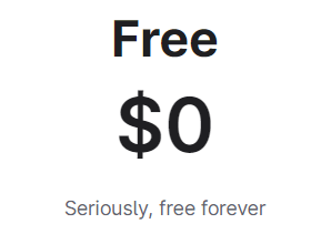
Make sure those are clearly visible under or next to your CTA because they will be the last push your customers need before they convert.
The “money guarantee policy” also works for converting free plan users to paid plan users since those 3 words give them more confidence that they won’t waste their money.
Another innovative example of “minimum commitment” is embedded interactive demos, where customers get to experience your software without leaving any information. This is great for turning visitors into leads without burdening the sales team.
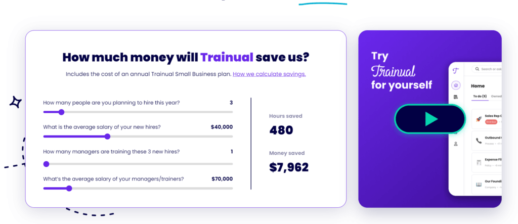
Trainula got a +450% [4] lift in free trial signups when they embedded an interactive demo on their website so that customers can see on their own how the tool works.
4. Offer Numerous Payment & Pricing Options
As we saw in the case of ChatGPT +, there is a percentage of customers who want to pay, but you aren’t giving them the right methods to complete a transaction. You should offer 3 – 5 different payment methods to ensure this isn’t the issue that is causing low conversions.
The best way to find out what payment methods your customers prefer is to survey them and adjust accordingly.
As for pricing options, if the jump from “free plan” to “paid plan” is too high, think of adding middle plans that will satisfy a portion of customers.
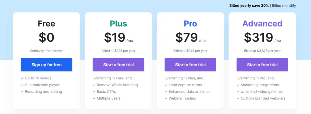
5. CRO Optimize the Checkout page (No distractions)
If a portion of the leads bounces during the checkout process, that means something has distracted them. They’ve already gone too far not to trust you. Therefore, the page is probably leading them somewhere else.
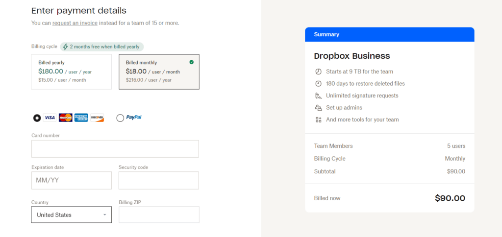
Make sure your checkout page is simple and clear while offering the most important information.
Below is an example of a checkout page with clear instructions and a summary of your cart on the right.
6. Show Social Proof
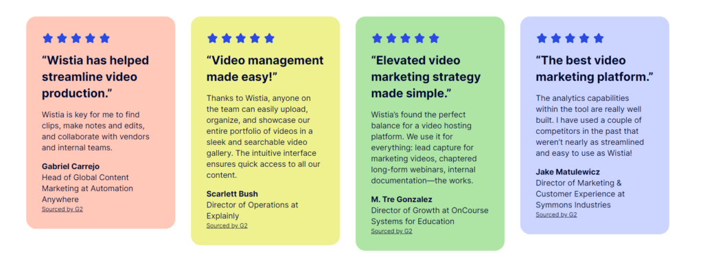
For building trust, there is nothing better than showing social proof – here is what my customers say about us. Your customers will speak in the way that is most appropriate to your target audience and will naturally emphasize the aspects that they like.
Therefore, after explaining the features and the use cases, make sure to include social proof in the form of reviews and testimonials. Video testimonials grab the attention of readers the most, so make sure to include those.
If you want to convert free trial users, make sure to show testimonials of people who went through that journey because they will highlight the benefits and the pros they got from the paid plan.
How to Know if the Strategy is Working?
These are proven strategies that have worked for many SaaS companies in the past. However, without testing, you won’t know how your target audience will react to it. You need A/B testing to see how your audience reacts to different copies and then keep using the one that converted more users.
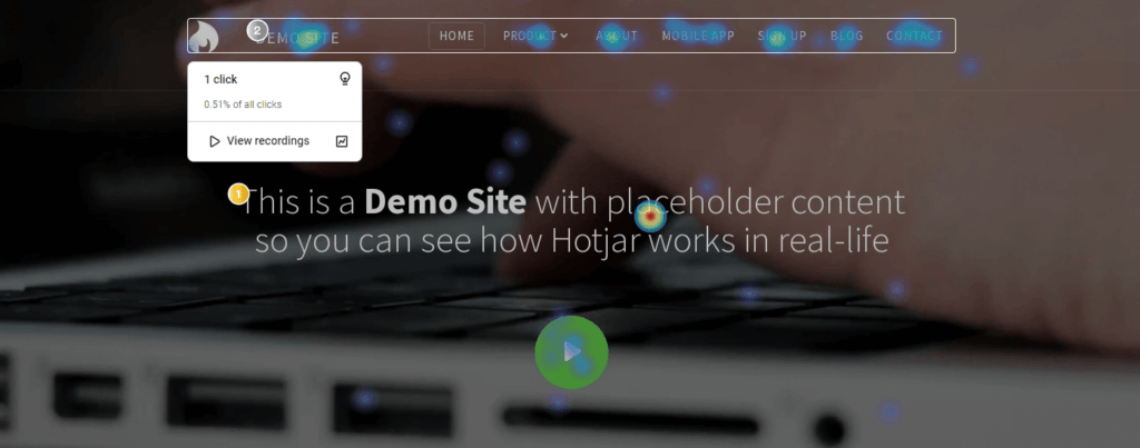
Apart from tracking conversions with GA4, don’t forget to use heat maps to monitor your customer behavior in detail. With Hotjar’s tools, you can monitor and record your website and see where your users click, what they avoid, at what moment they leave, which page is the most visited, etc.
You can even monitor specific actions such as “cart abandonment” to get even more insights into why your customers aren’t converting.
Conclusion
In 2025, companies should focus on creating a targeted user experience from the entry point to the final click. By benchmarking their conversion rates against industry averages and continuously monitoring and optimizing their performance, you can ensure that no website visitor slips through the cracks.
By A/B testing your landing page copy, including different payment options, showing social proof and tracking customer behavior, you can decrease cart abandonment rates and improve your ROI. With the help of a SaaS SEO agency, you can speed up the process.
If you don’t want to test on your own, book a call today with NUOPTIMA, and we will prepare your ideal conversion rate optimization strategy.
FAQ
The average conversion rate for SaaS brands lies somewhere between 20.95%, according to our research. However, there are many types of conversion rates, so we advise you to focus on the type that is most important to you and benchmark your progress accordingly.
To drive more sales, you need to CRO your checkout page, A/B test your copy and monitor user behavior with heat maps and analytics tools. With proper strategies and testing, you can scale your B2B SaaS fast.
