A SaaS landing page is a webpage specifically designed for warm leads interested in your offering and guide them towards buying your product/service. By being the last point of contact before purchase, the SaaS landing page design has to mirror the audience’s behavior, language and pain points and make them take action swiftly.
Do SaaS brands only have one landing page?
The number of landing pages for an average SaaS company ranges from five to forty. In fact. Hubspot’s latest State of Marketing report[1] shows that companies with more than 40 landing pages saw an increase in conversions by over 500%.
Even though, in this case, “the more the merrier” applies, you don’t need to build dozens of landing pages right away. This case study[2] shows that by tailoring your existing content blocks that directly call out and address your target audience’s pain points, you can increase conversion rates by 10.41% and revenue per user by 13.46%.
However, when it comes to scaling lead generation effectively, working with a specialized SaaS lead generation agency can significantly boost your efforts by implementing targeted strategies that align with your business goals.
In this article, we will share SaaS landing page best practices and conversion tips, key elements of different landing pages, and examples of successful landing pages with in-depth explanations to improve your B2B SaaS conversion rate.
7 Common Elements of a High-Converting SaaS Landing Page
First of all we will go over the seven common landing page elements all successful webpages have, so you can tick them off your list. These seven elements contribute to making your audience feel like you know their problems and can offer them a solution.
With proper design elements, order and optimization, your landing page will be your fastest converting page.
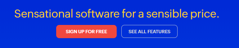
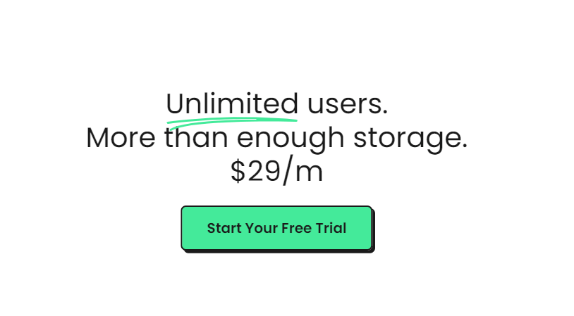
1. The Hero
The “Hero” section is the first thing your lead sees when they open your landing page. This section is the meat of your webpage and should contain the headline and subheading, a compelling call-to-action and an eye-catching visual.
With direct copy highlighting the benefits of your product/service, most of your potential leads will convert without scrolling.
Pro tip: Make sure this section is short and concise (one to two sentences) with a clear CTA that doesn’t confuse the reader.
2. The Headline
The headline is usually larger than the rest of the “hero” section and, thus, the first thing 90% of your readers will see. It needs to be short, to the point, and directly tell your audience if they are in the right place. By doing the right target audience will stick and the wrong one will move away.
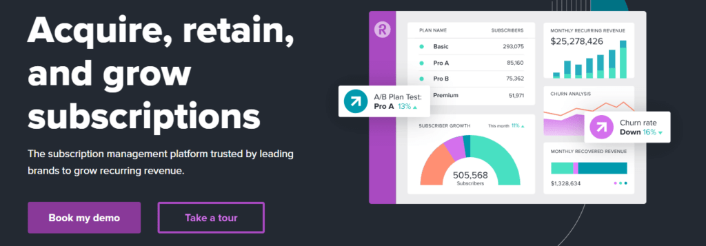
Besides being larger and bolded the heading should be short, clear and have words that automatically showcase a benefit – acquire, retain and grow subscriptions. Avoid using vague phrases like “enhance your customer journey” because it isn’t a direct and clear benefit.
3. The CTA
CTA’s or calls to action are usually found in multiple sections of the landing page. First and foremost in the Hero section, but they should have a place in the middle and end of your page.
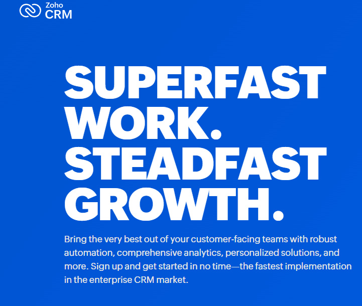
Zoho CRM does a good job leading their audience to either sign up or continue with their research, leaving little room for them to bounce off their page.
4. Features and Benefits
Your landing page should have a section where the benefits are features are clearly listed. Each feature/benefit should be clearly and separately listed so the user can get the gist of your tool/service right away.
These sections can either have CTAs or links to other resources with a more in-depth explanation of each feature/benefit.
5. Contact Form
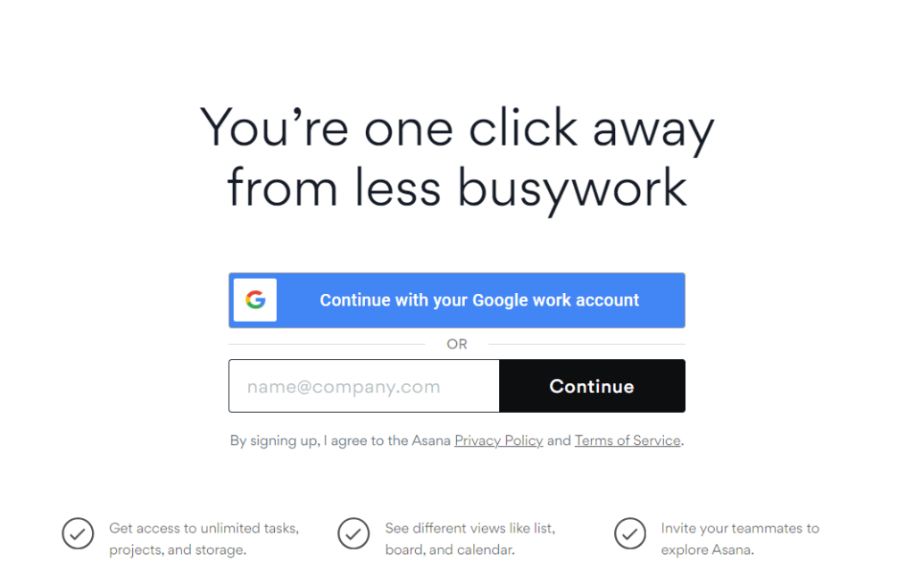
A contact form is a great way to obtain the reader’s personal information and make the onboarding process easier. The contact form should clearly state the benefits – get access to unlimited tasks, projects and storage.
The contact form should be in the middle or towards the end of your landing page after you’ve already warmed up your lead.
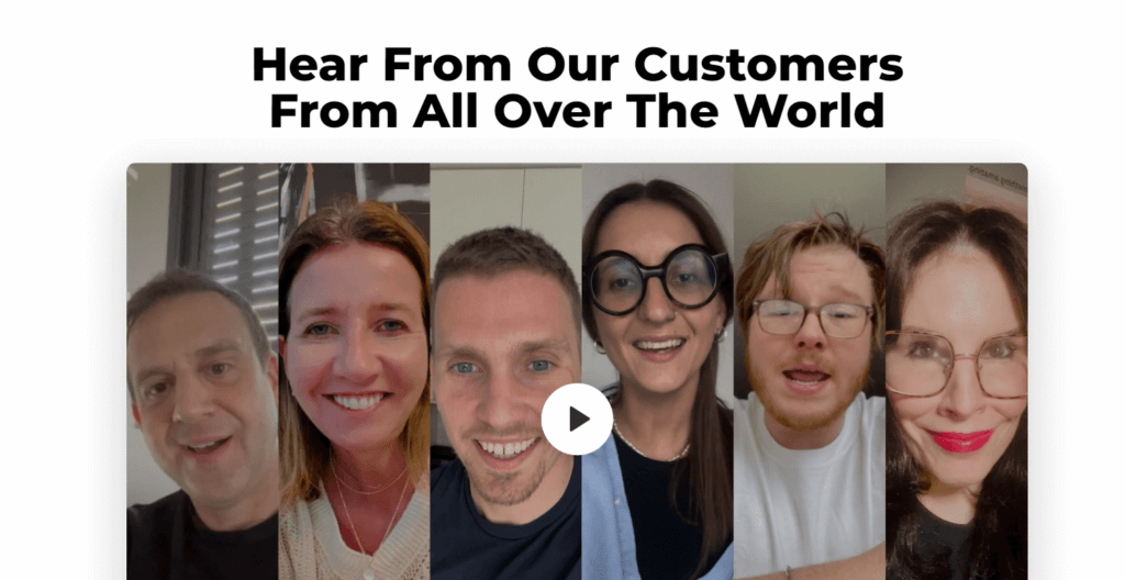
6. Social Proof
Well-known names will always catch your attention, won’t they? With the attention span decreasing and brand loyalty booming, software companies need a way to gain the audience’s trust with proven success and good SaaS inbound marketing strategies.
Even if your buyers don’t give you any type of testimonial you can at least put their logo that will intrigue your potential leads.
However, it is even more powerful to have a written or video testimonial that shows you are the real deal. This extra effort will pay off big time because you will acquire new leads by letting someone else tell them why they chose you.
The social proof section is usually found in the middle and towards the end of your landing page like a cherry on top, waiting to convince the doubters.
7. Demo Video
It is no secret that we are living in the video era, and yes, they’ve made their way into landing pages. Apart from being used as the “realest” form of social proof and customer testimonials, they are also a great walkthrough or virtual tool for demonstrating your software.
Getting on a call with a prospect is an extra step some of your leads won’t take. With interactive demo videos, you are helping them understand and “use” your software without any commitment.
Back in the day, free trials and freemiums were the lowest effort and commitment possible, but now interactive demo videos take the stage.
Make sure to put your video near the beginning of your landing page because it will bring value to both the warm-up leads and the unaware customers. Make sure your demo is:
- Interactive – Users who interact with a tool have a higher chance of remembering the features, steps and UI
- Short and concise – No need to tell them everything, just the most important features and use cases
- Titled – Nothing worse than a surprising voice
- Beginner-friendly – Make sure to cover the basics and address the pain points of your audience.
5 Examples of Successful SaaS Landing Pages
Now that you know the seven key landing page elements, lets see how SaaS brands have used them for creating high-converting landing pages. We will go over five landing pages in detail and show you all the tips and tricks behind them:
1. Influee
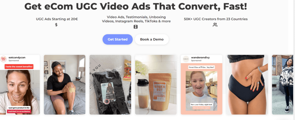
Influee’s[3] landing page is a great example of a video format used for demonstrating the use cases and value of their platform. As A UGC video service platform, they’ve responded to every question and doubt and thought through the very thing they sell – videos.
It takes you 5-6 scrolls to get to the end of their landing page, with multiple content types, short copy and multiple CTAs.
The best parts of Influee’s landing page:
- Short, concise heading
- Customer testimonials
- Collaboration breakdown
- Doubts and questions answered
- Clear benefits
- Use of video format
Now, let’s comment on each stellar section of this landing page:
Source: Influee
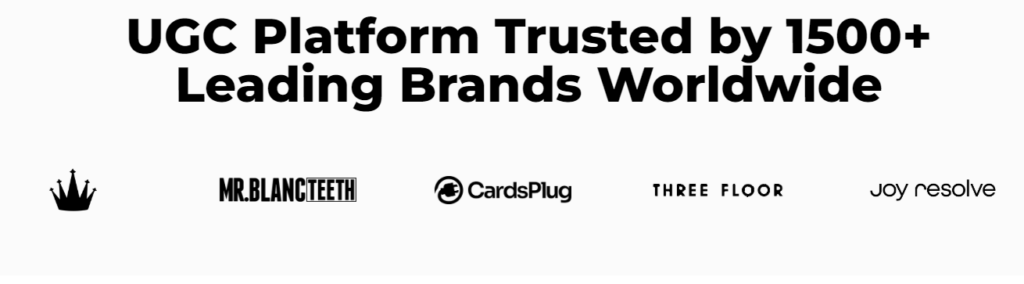
Yes, they used logos, but they also used the power of numbers to demonstrate their success easily – 1500+ brands. Whenever possible, use numbers/statistics to demonstrate a point.
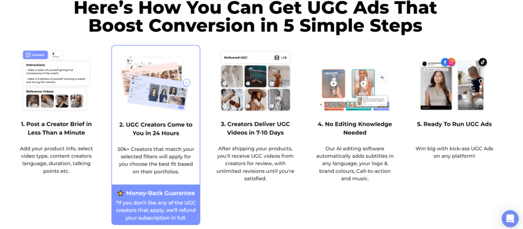
The following section sums up everything you need to know about this platform in five simple blocks of text. But they’ve added a little twist, an eye-catching benefit that will help with instant conversions – a money-back guarantee.
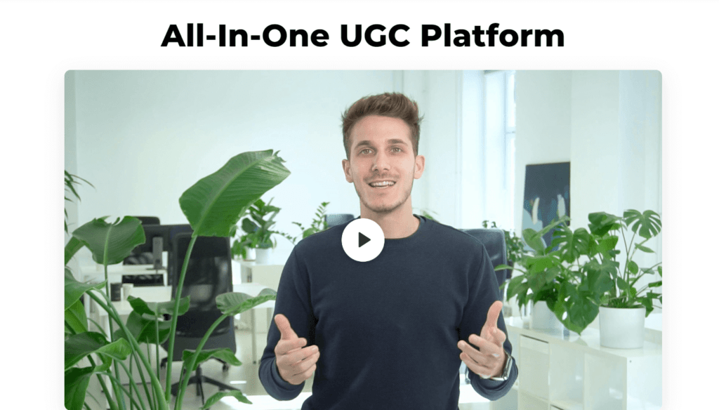
In the following section, they put a little more effort into explaining their platform with a friendly approach – the founder explaining the ins and outs.
They’ve also used video testimonials to strengthen their customer loyalty and promote their brands through the lens of their target audience.
One thing that really stood out from other landing pages is the following section, which has the intent of convincing the part of their target audience that hasn’t converted just yet. They’ve given the use cases, benefits, testimonials and in-depth explanations; what else?
Well, the only thing left is to answer all their potential questions and erase all doubts.
Influee did that by demonstrating with short copy and quick videos. For example, if a part of their audience questioned whether or not this app is only for English speakers, they cleared that doubt with the first video.
2. Gather

A minimalistic design but a very powerful landing page is Gather’s. They’ve managed to sum up the value of their virtual HQ’s platform in a couple of short videos and even shorter copy, and it is one of my favorites.
The best parts of Garther’s landing page:
- Video content
- Clear CTA
- Achievements
- Concise feature list
Now, let’s comment on each stellar section of this landing page:
The features and benefits are rolled out in a logical Z format, with certain words being colored to stand out. With an image demonstrating their point, they easily grab attention.
Two things to notice here.
First, the sticky CTA with an eye-catching offer that will convert a % of the readers.
The second one is the simple but clear and precise features/benefits list helping users to take a look and see if the platform is the right fit for them.
Like most big brands, they don’t shy away from their achievements but highlight them in the section below customer testimonials.
3. ClickUp
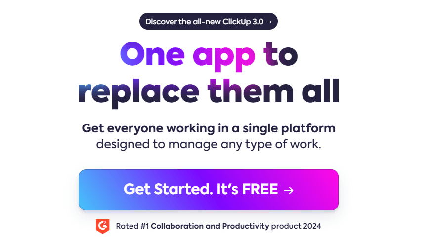
ClickUp’s landing page stands out due to the use of power words and short, concise blocks of text to demonstrate their main points. It is one of the shorter ones on the list, with 4–5 scrolls for the whole landing page, but very value-packed and visually appealing.
With one sentence, “one app to replace them all”, they’ve summed up their whole platform.
The best parts of ClickUp’s landing page:
- Highlighted important parts of text
- Emphasis on their existing success
- Well-organized feature set
- Loading speed time
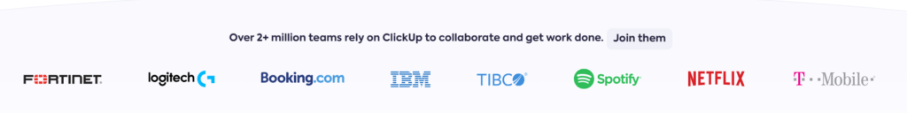
They’ve created a FOMO effect with the first sentence and strengthened it with top-notch names and logos right after.
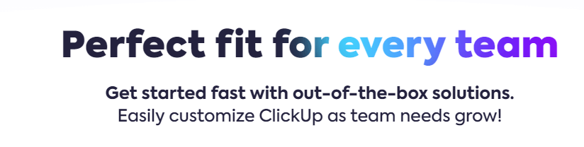
ClickUp’s landing page answers two main questions/doubts their target audience may have and gets into the meat right away. With this one-click menu, you can browse and get detailed information on their features.
The CTA for each product section is clearly visible and right next to the customer testimonial.
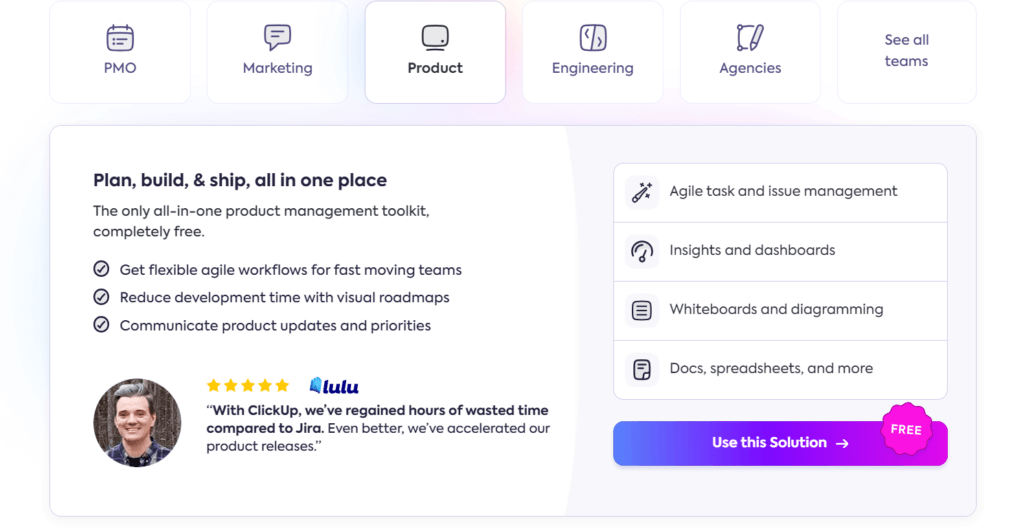
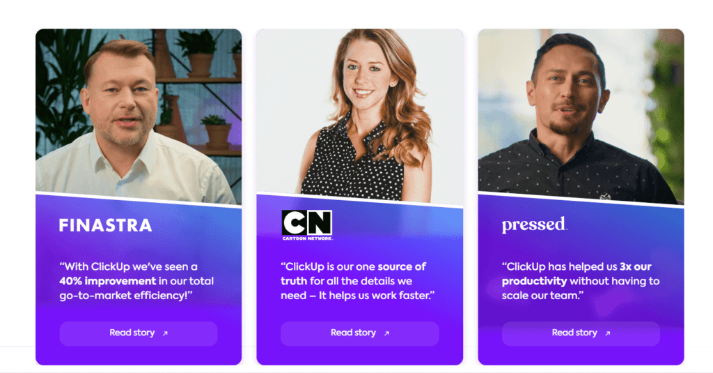
The importance of social proof is very much visible on this landing page because this is the third time ClickUp used their customers’ words and faces to promote their brand.
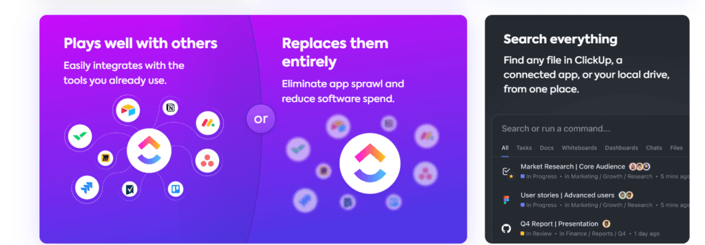
ClickUp’s design does a great job of summing up the features and benefits of its platform.
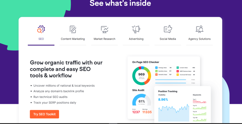
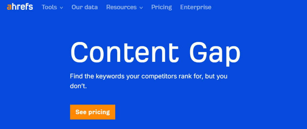
4. Semrush
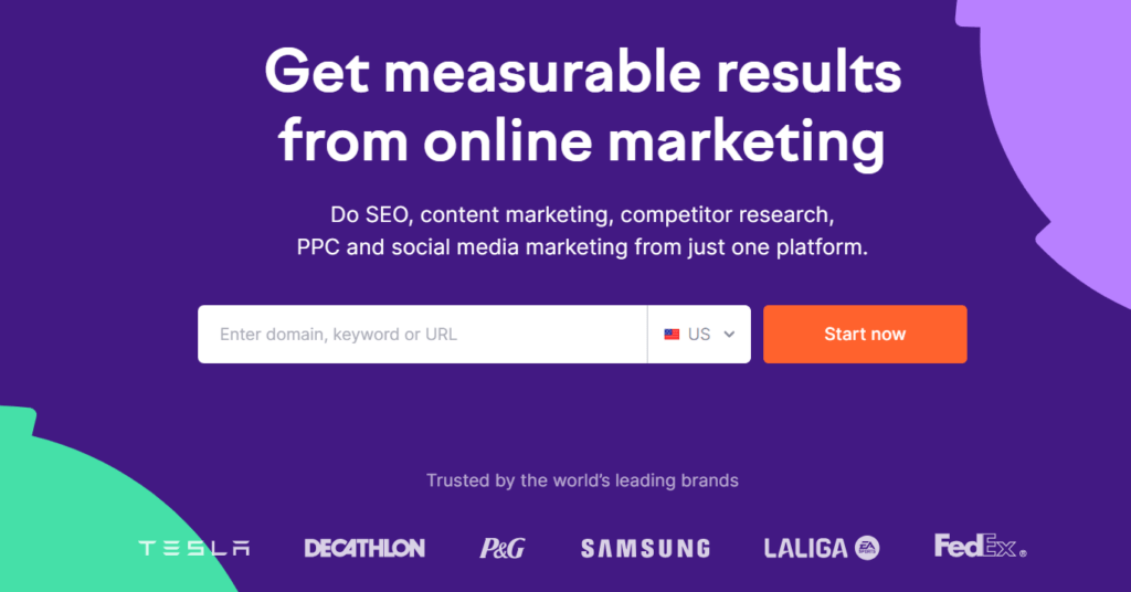
Semrush’s landing page is filled with interesting insights, from the way they showcase their features to customer testimonials and direct copy.
The best parts of Semrush’s landing page:
- Interesting feature presentation
- Live demo available
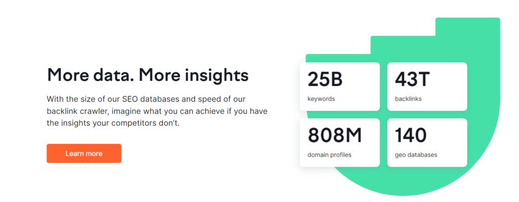
- Data presentation

The fact that you can instantly test the tool is one of the best tactics for product demos in the world.
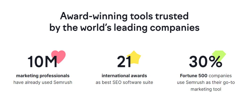
They also use numbers to their advantage to demonstrate the power of their brand.
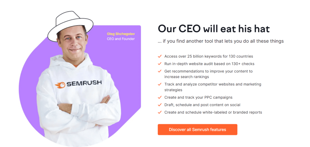
The most interesting part about their landing page is their “white hat” pun that clearly demonstrates their value propositions.
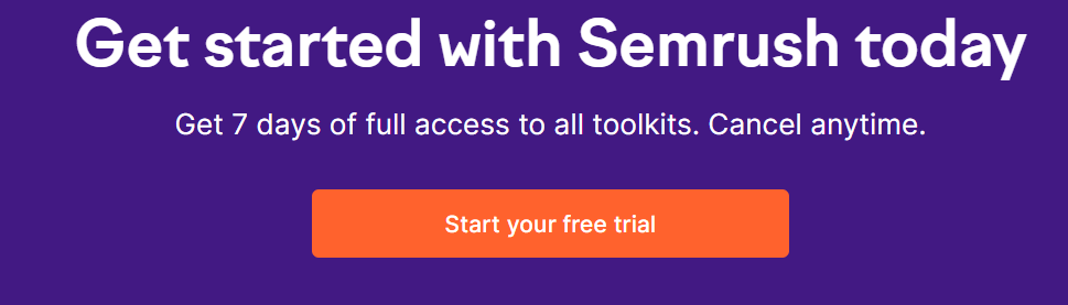
The CTA is clear, simple and in the order of 3-2-1, just as the human brain sees the titles.
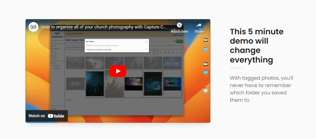
5. Capture Collab
The shortest landing page on the list, but one of the most effective ones for sure is Capture Collab’s. They’ve managed to incorporate all the necessary elements of a high-converting landing page in an intuitive design with loads of different content types.
The best parts of Capture Collab’s landing page:
- Demo video of their tool
- Interesting customer testimonials
- Highlighted words
- Clear copy and CTA
Now let’s break down their landing page in detail:
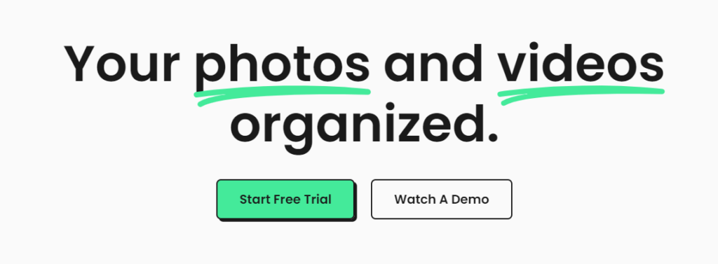
One of the few headings that is so to the point that it doesn’t need any further explanations. With 2 different CTA options, Capture Collab is directing its audience in the right path (s). Finally, the highlighted “photos” and “videos” grab the attention right away.
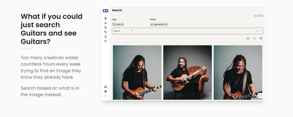
One heading, two paragraphs, and a mini video is all it takes to demonstrate the value of their platform. They mention the pain point and offer their solution right away.
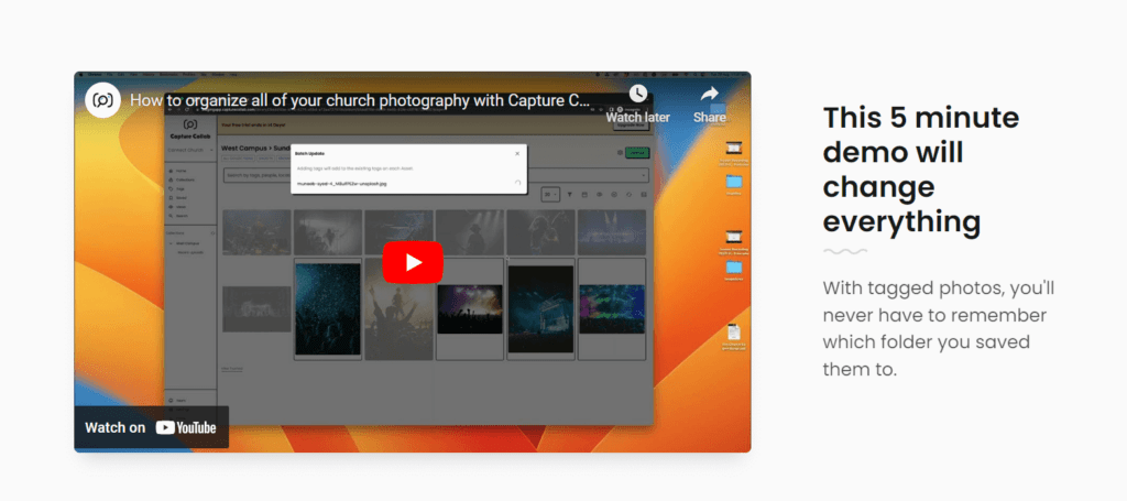
For those who are interested, they are offering a longer demo that will spark their interest even more.
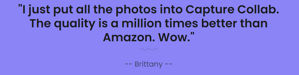
Their best customer testimonial is prominently put in the right place after the demo.
Finally, their CTA answered 2 main doubts their customers may have and invited them for a free trial.
5 Common Mistakes to Avoid When Designing Your SaaS Landing Page
Here are the five common mistakes you should avoid when creating or optimizing your landing pages:
1. Forgetting about Mobile Optimization
Even though a lot of landing pages are being viewed through a mobile phone, I still see many of them that aren’t optimized for them. This interferes with the user experience, and in most cases readers just bounce and never return.
To not lose those conversions and stop your SaaS growth due to technicalities, you need to compress images and videos so they load quickly and use concise headlines and clear, easy-to-read fonts. If you have a form (one of the key elements we mentioned above) make sure users can fill it in on their mobile device as well.
Avoid pop-ups and optimize page speed with minimal HTTP requests and browser caching.
2. Not doing A/B testing
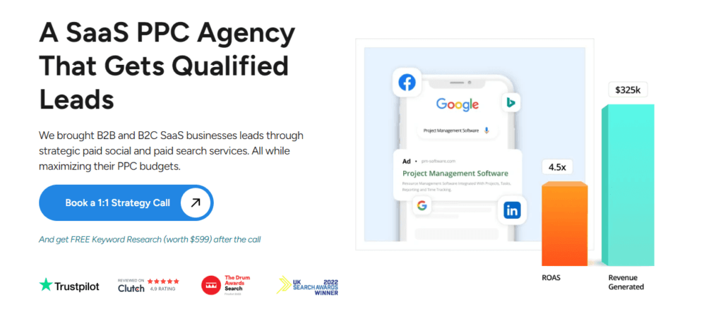
Without your own internal A/B testing, you will never find your “ideal” landing page, according to our SaaS PPC agency. Plus, your customers, goals and tactics grow and evolve over time, so you need to have data to back up your changes.
A/B testing of landing pages implies that you identify elements (headings, visuals, CTAs, forms, etc) and create different versions for them. Then, you set up a test using an A/B testing tool to statistically see the differences in conversion rates between the variations.
Keep in mind that you should select a time(at least a month) when the testing will be conducted. Real results will be seen in 1-3 months, so be patient and consistent. A/B testing is the fastest and most efficient way to determine what your target audience is reacting to.
Even though heat maps and regular changes show some insights, direct testing is one of the best options.
This case study[4] shows an increase of 42.11% in people who proceeded to the checkout page, after a CTA optimization.
3. Not Having Multiple Landing Pages
If you have different audience segments, complex tool sets or run numerous marketing campaigns, one landing page won’t fit all needs. Just ensure to segment your audience and keep branding and messaging consistent. For SaaS business founders looking to expand their knowledge, check out our list of SaaS books for more insights.
Learn how to build your SaaS sales strategy in this article.
4. Not Optimizing Your Navigation Bar
Your target audience should always know where they are and what they can do next. Apart from the CTA, your navigation bar should clearly give them gateways based on their interests. Usually, the tabs indicate those who are ready to make a purchase “pricing” and those who need more convincing “resources, feature list”.
With a clear, short and sticky navigation tab, your readers will browse through the rest of your website and find what they need. Don’t make the navigation bar overwhelming or hard to find because your readers will be disconnected from the rest of your website.
5. Ignoring Page Length and Scrolling Suggestions
The last piece of advice for your landing page is to make sure your page length is between 1-5 scrolls. This may not seem like it, but it is an important part of the SaaS sales process.
Don’t overdo it with content and visuals so that your readers don’t need to skip a lot to get to the end.
Explore innovative growth strategies by listening to the Nuoptima SaaS Podcast featuring Codie McGuffie from EverBee.
Conclusion
From this in-depth guide packed with examples, we can conclude that there are seven key elements that all high-converting landing pages have in common. The differentiation lies in the placement of those elements, length, number of pages, and design, which gives you a lot of space to personalize and customize your landing pages.
We at NUOPTIMA, a B2B SaaS SEO agency, can help you get a high-converting SaaS marketing funnel with our conversion optimization service. With our insights and recommendations, you will get conversion-optimized pages in no time!
Book a free call with our team, and start increasing conversions today!
FAQ
A software landing page is a webpage with the intent of converting leads into buyers. A software landing page should have a short overview of features, use cases and benefits alongside a CTA and social proof. If you set up your landing page correctly, it will become your number-one page for conversions.
A product page has detailed information about the product in terms of pricing, features, integrations, customization level, etc. A landing page has only an overview of features, and aims to convert potential leads.
A SaaS landing page should start off with a short heading, followed by a featured overview, demo, customer testimonials and CTA. Before asking the lead to sign up or buy your product, you need to give them value and answer any questions or doubts that may stop them from clicking on your CTA.
References
- https://www.hubspot.com/state-of-marketing[1]
- https://www.linkedin.com/pulse/maximize-arpu-cvr-personalized-landing-pages-using-content-sokolov-zq4ge?utm_source=share&utm_medium=member_ios&utm_campaign=share_via[2]
- http://influee.co/[3]
- https://convertica.org/lead-generation-case-study-free-trial-sign-ups/[4]